SAMSUNG I9505 GALAXY S4 - 16GB Prices
Important Note.
- All prices are in Pakistani Rupee (PKR)
- Prices may vary at stores and our effort will be to provide you with the updated prices.
- Find out WhatMobile price has dropped in Pakistan by selecting Notify Price Drop button
- Find out WhatMobile has better specifications by clicking Add To Compare Button find out what Mobile has better reviews by visiting our reviews section
- Find out WhatMobile is cheaper on which retailer by clicking Compare prices from retailers button
Search Terms
- SAMSUNG I9505 GALAXY S4 - 16GB
Specifications
| GENERAL | |
| 2G Network | GSM 850 / 900 / 1800 / 1900 - all versions |
|---|---|
| 3G Network | HSDPA 850 / 900 / 1900 / 2100 HSDPA 850 / 1900 / 2100 - SGH-i337 |
| 4G Network | LTE 800 / 850 / 900 / 1800 / 2100 / 2600 LTE 700 MHz Class 17 / 1700 / 2100 - SGH-i337 |
| Sim | Micro-SIM |
| Announced | 04/03/2013 |
| Status | Available. Released 2013, April |
| BODY | |
| Dimensions | 136.6 x 69.8 x 7.9 mm (5.38 x 2.75 x 0.31 in) |
| Weight | 130 g (4.59 oz) |
| DISPLAY | |
| Display Size | 1080 x 1920 pixels, 5.0 inches (~441 ppi pixel density) |
| MultiTouch | Yes |
| Protection | Corning Gorilla Glass 3 - TouchWiz UI |
| SOUND | |
| AlertTypes | Vibration; MP3, WAV ringtones |
| LoudSpeaker | Yes |
| 3.5mm jack | Yes |
| MEMORY | |
| CardSlot | microSD, up to 64 GB |
| Internal | 16 GB storage, 2 GB RAM |
| DATA | |
| GPRS | Yes |
| EDGE | Yes |
| Speed | HSDPA, 42.2 Mbps; HSUPA, 5.76 Mbps; LTE, Cat3, 50 Mbps UL, 100 Mbps DL |
| WLAN | Wi-Fi 802.11 a/b/g/n/ac, dual-band, DLNA, Wi-Fi Direct, Wi-Fi hotspot |
| Blue Tooth | Yes, v4.0 with A2DP, EDR, LE |
| InfraredPort | Yes |
| NFC | Yes |
| USB | Yes, microUSB v2.0 (MHL 2), USB On-the-go, USB Host |
| CAMERA | |
| Camera Primary | 13 MP, 4128 x 3096 pixels, autofocus, LED flash, check quality |
| Camera Features | Dual Shot, Simultaneous HD video and image recording, geo-tagging, touch focus, face and smile detection, image stabilization, HDR |
| CameraVideo | Yes, 1080p@30fps, dual-video rec., check quality |
| CameraSecondary | Yes, 2 MP, 1080p@30fps, dual video call |
| FEATURES | |
| Processor Cores | Quad-Core |
| OS | Android OS, v4.2.2 (Jelly Bean), upgradable to v4.4.2 (KitKat) |
| CPU | Quad-core 1.9 GHz Krait 300 |
| Sensors | Accelerometer, gyro, proximity, compass, barometer, temperature, humidity, gesture |
| Messaging | SMS(threaded view), MMS, Email, Push Mail, IM, RSS |
| Browser | HTML5 |
| Radio | No |
| GPS | Yes, with A-GPS support and GLONASS |
| Java | Yes, via Java MIDP emulator |
| Colors | White Frost, Black Mist, Aurora Red (AT&T only), Arctic Blue, Purple Mirage, Brown Autumn, Pink Twilight, Black Edition |
| Others | - Wireless charging (market dependent) - ANT+ support - S-Voice natural language commands and dictation - Smart stay, Smart pause, Smart scroll - Air gestures - Dropbox (50 GB cloud storage) - Active noise cancellation with dedicated mic - TV-out (via MHL 2 A/V link) - SNS integration - MP4/DivX/XviD/WMV/H.264/H.263 player - MP3/WAV/eAAC+/AC3/FLAC player - Organizer - Image/video editor - Document viewer (Word, Excel, PowerPoint, PDF) - Google Search, Maps, Gmail, YouTube, Calendar, Google Talk, Picasa - Voice memo/dial/commands - Predictive text input (Swype) |
| BATTERY | |
| Battery | Li-Ion 2600 mAh battery |
| StandBy | (2G) / Up to 350 h (3G) |
| TalkTime | (2G) / Up to 17 h (3G) |
| MISC | |
| SARUS | 0.77 W/kg (head) 1.17 W/kg (body) |
| SAREU | 0.28 W/kg (head) 0.40 W/kg (body) |
Reviews
Introduction
The Samsung Galaxy S4 is now two years old, and not only was it replaced by the Korean firm's 2014 flagship offering, the Galaxy S5, but the Samsung Galaxy S6 was recently launched at MWC 2015.
That means that the Galaxy S4 is now feeling a little long in the tooth. To make matters worse, Samsung has also released the innovative Samsung Galaxy S6 Edge, a version of the Galaxy S6 with a curved screen that wraps around two edges.
Without the fancy new bells and whistles that Samsung is including in its latest flagship phones, the Galaxy S4 can almost feel as if it is a relic from another age. However just because two years is a long time in smartphones, it doesn't mean that we should write off the Samsung Galaxy S4 just yet.
Its replacements haven't spelled the end for the Galaxy S4 - it's still on sale, at a lower price point of around $368. It has also dropped in price on contract.
That isn't too bad for a handset that is still pretty well specced. What's more, Samsung is continuing to churn out software updates for it.
Samsung was quick to upgrade the Galaxy S4 to Android 4.4 KitKat. Together with a few minor Samsung additions and modifications, it tightens things up behind the scenes for a slightly sprightlier navigation experience.
And here's some good news for followers of the latest smartphone trends: the Samsung Galaxy S4 is getting an upgrade to the latest version of Android 5.0 Lollipop with the upgrade rolling out now.
If you've already got a Samsung Galaxy S4, head over to our guide on when to expect the Android 5.0 Lollipop upgrade. We update it constantly, so it's your best source for finding out when the new operating system will reach the Galaxy S4.
But let's consider the S4 in context: as an upgrade to the how-is-it-still-on-sale Galaxy S3. One of the most impressive things about the phone was the fact the size hadn't changed from the S3 - the Galaxy S4 comes in at 136.6 x 69.8 x 7.9mm, meaning there's no extra heft to try to work with in your palm.

However, despite this fact, the screen on the S4 has been increased once more, to a 5-inch display with Full HD resolution. OK, so it's no longer a big deal when compared to the QHD offering on the 5.5-inchLG G3 and 5.7-inch Galaxy Note 4, but that doesn't mean it's not a greatly impressive screen.
I should also note that the Galaxy S4 is considerably smaller and lighter than its successor, the Galaxy S5, despite conceding a mere 0.1 of an inch in screen size. This is evidently a result of the S5's tougher water and dust-resistant construction, but not everyone will count this as a worthwhile compromise.
The Galaxy S4 shared a lot with the other top smartphones of its era. Both the Sony Xperia Z1 and theHTC One have screens that use the same resolution, but neither of them have the still impressive clout of the Super AMOLED HD screen on offer here.

On top of that, there's a much faster processor packed under the hood, ample storage space for media thanks to an expandable memory card slot, and 4G, Bluetooth 4.0, NFC and pretty much any other connection you care to mention on board.
Samsung has tried to supplement this with a tranche of software upgrades too, meaning a more powerful camera, a better way to communicate with your friends and consume media, and interestingly a big push into health through dedicated apps too.
Design
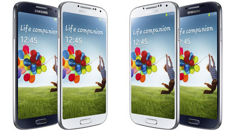
Before I dissect all the possibilities the phone has to offer, let's look at the design. As I mentioned, the Samsung Galaxy S4 is impressive in its form factor, thanks to the sub-8mm thickness. At 130g it manages to still be light without shaving off so much heft that you feel like you've got a flimsy piece of plastic.
That's probably the biggest compliment I can pay the Samsung Galaxy S4 - where its predecessor felt a little bit cheap in the hand, the S4 manages to bring a much more solid build and better construction to boot.
So while the "faux metal" band makes a comeback on this model, it looks a lot more premium. And there's very little flex in the chassis when you hold it tightly, which was another problem with the Galaxy S3.

It can get dented very easily though, and be careful not to crack your screen if you do so - I've heard of a few instances where this has happened to Galaxy S4 users, although that can be said of many other polycarbonate smartphones.
That doesn't mean that the phone is completely remodelled from the S3 - it's very similar in appearance, so much so that a number of people asking to see it during my review thought I was palming them off with my old S3. The polycarbonate chassis remains, but that brings with it the faithful battery cover, which conceals a removable battery and microSD slot.
I'm not so fussed about the battery being able to drop out of the phone - so few people carry around a spare battery, and nowadays portable charging blocks are becoming so cheap and light that they make much more sense.

I'd almost prefer something like the Sony Xperia Z3, which has a refined and packaged chassis but doesn't need a removable battery instead it makes use of a slot for the memory card. This integrated nature would make for a slightly more premium feel to the phone.
However, it's a small gripe with the Samsung Galaxy S4, as while the cover feels flimsy, it's better than it was on the S2 and the S3, and they both sold like hot cakes.
In the hand, the Samsung Galaxy S4 feels much better than any other Samsung phone I've held (apart from the gargantuan smartphones the brand used to make - the i8910 Omnia HD might have been built like a brick, but it felt wonderful to hold). The screen's spread towards the sides of the phone means a much narrower bezel, and the effect is certainly impressive.

It might look very similar to the S3, but when you take the Samsung Galaxy S4 up close, you really start to appreciate the nuances.
I'd say it feels a lot more like the old LG Optimus G range now - when I first picked it up, I was struck with how similar it felt in terms of sturdiness and the polycarbonate construction to the LG Optimus G Pro.
It's since been mimicked once more by the LG G2, which was a real competitor to this handset when it first launched - it's got the same ugly plastic case, but much improved innards at the same price.
That's no criticism, as the device is well built, but it has a similar rounded feel. This is intriguing given the history of the two companies, and shows more of a leaning towards the plastic shell from the Asian brands in general.

The buttons have barely changed from before - the power button has been shifted slightly on the right-hand side, and is now much easier to hit. Samsung has clearly taken some lessons from the Galaxy Note 2, which has a really well positioned power/lock button.
The volume key is less easy to hit, and could be lower down in, but the travel on both of these buttons is satisfying, and you'll always know when you've hit them.
The plastic used on the home key has been upgraded too, with a more solid feel under the thumb when you press down to get back to the main home screen. The two buttons flanking it give you access to menus or take you back from whence you came, and while both are easily hidden, they light up nicely with an even glow when called into action.

There are loads of sensors on the front of the phone above the screen, including cameras to track your eyes, a 2MP camera for HD video calling and a proximity sensor for knowing where the phone is in relation to your ear. On the white review unit I had their presence looks rather ugly either side of the generous earpiece, but on the darker models this is less of an issue.
The other notable addition to the design of the Galaxy S4 is the infrared blaster on the top of the phone. This enables you to control your TV, satellite box, DVD player, amp and even air conditioner. Again, this isn't a new feature, but it works well in practice, and despite being small is powerful enough indeed.
Other than that, there's not a lot more to say about the design of the phone, as it's just a little underwhelming. I know it's unfair to lambast a brand for not overhauling the design every year, but in the One X and the One, HTC proved that it is possible to offer up a new design over successive generations and still keep things attractive.

Looking so similar to the Galaxy S3, you can't help but feel Samsung has gone a little too Apple and created something more in keeping with the Samsung Galaxy S3S - a minor update to a great phone to keep those coming out of contract happy that they have a premium phone to upgrade to.
I do implore you to get the phone in your hand before making your judgement though. While it's not got the best design on the market when it comes to materials, it's a big step forward compared to the Galaxy S3 and allows for a grippy and easy-to-hold phone, with a whopping screen inside.
It still feels cheap as chips compared to the iPhone 6 and HTC One M8 though.
To just dismiss it for being plastic would be doing the Galaxy S4 a disservice as it has so much more going for it than that. But it's worth remembering that to a lot of people, the way a phone looks is as important as how much RAM it's got on board and how fast the CPU is - if not more so.
Key features
At the time of its release, the Samsung Galaxy S4 came with what I felt was the best display you could find on a smartphone. While it's since been superseded by the likes of the LG G3 and the Samsung Galaxy S5, it still holds up to scrutiny today.
It's the same Super AMOLED technology used in other Galaxy smartphones, but it was the first in the range to be cranked up to Full HD resolution, which is 1920 x 1080 pixels, if you're asking, meaning a still-sharp 441ppi.
This uses the same PenTile matrix that's drawn so much criticism over the years, as some state that Samsung is using too many of one colour of pixel, or that the sub-pixel (the colours within each pixel) arrangement is too basic. All of this has meant that older Galaxy smartphones have had something of a blue or green tint, or been a little low-resolution when viewed (admittedly very) close up.

Well, and you'll forgive me for saying the same thing that I did with the Galaxy S3, close up now there's no way you can see any jagged edges or elements within the icons. It's simply superb, and makes everything from web pages to video look brilliant.
There's no worry about the tints of old, nor the criticisms levied at Samsung for making over-saturated screens, as often people have claimed that the colours look too strong on these devices thanks to the OLED technology used.
It is a feature of the technology, and not just because of the high contrast ratios on offer, but with the Galaxy S4 Samsung added in a mode to make the colours look more natural, should the user so wish to have it that way.
This method does drop the brightness somewhat, and that's already lower than you might find on theHTC One, but that extra brightness isn't needed thanks to the contrast ratio I mentioned earlier.

One of the strengths of OLED technology is that when a pixel is displaying a black image, it's completely off, and therefore draws less power and looks darker. Compared to LCD screens, which have a backlight to light the colours in front, this means that the blacks will never be as black as found on an OLED.
So, as I said, there's nothing to want for with the Super AMOLED Full HD screen found on the Samsung Galaxy S4. It might not be as high resolution as the HTC One or the Google Nexus 5, simply because it's slightly larger with the same amount of pixels, but viewed up close you'll struggle to find a flaw with it.
You can change the brightness from the notification bar, accessed by sliding your finger down from the top of the screen, but if you want to make things easier you can just tag the auto button here and have the Galaxy S4 work away at deciding the optimum brightness for you.
You can also customise the auto level - so if you like things a little lighter or darker, then you can choose such a thing. It's a good way to manage your battery even easier.

Another display feature is the improved capacitive technology used in the screen. This is designed to ape a feature brought by Nokia on the Lumia 920, which enables you to wear gloves and still use the phone - which will be a key feature to those in colder climes, or who like to wear gloves for sport or similar.
There used to be an issue whereby this feature rendered the screen a little too sensitive and twitchy to the gloved touch, but having used the phone after the Android 4.4 update, it doesn't appear to be such an issue. Naturally, I'll let you know if extended use reveals otherwise.
All of which means there's not a thing that I can criticise the Samsung Galaxy S4 screen for in any way, as it's still close to perfect for a smartphone - making it a great device for so many more functions as a result.
Devices such as the LG G3 are starting to up smartphone screen resolutions to QHD standards, but the jury is out on whether this is wholly necessary, or whether the benefits outweigh the inevitable hit to battery life.

Until that's answered the Samsung Galaxy S4's screen will continue to be one of my favourites - particularly for the price.
Over recent years, Samsung has increasingly turned to software gimmicks in order to differentiate its smartphones from the crowd. It could be argued that this really started to get silly with the Samsung Galaxy S3, and looking at the Galaxy S4 afresh today confirms that Samsung tried to pack way too much in here.
There are tons of gimmicks, like Smart Stay. This isn't a new feature for the Galaxy S4, but it's a better implementation than we saw on the Galaxy S3. Back then the result was a little patchy, and also contributed to some dodgy auto-brightness levels.
In case you don't know, Smart Stay is another of Samsung's eye-tracking technologies, one that can tell when you're looking at the screen and won't dim or put it into sleep mode as a result.
This time around it's nearly flawless at checking out when your eyes are looking at the screen, although when it does get it wrong and things begin to dim there's no way to save it (despite us blinking and flashing our eyes at the display in the vain hope the S4 might recognise the effort).
Of course, you could just tap the screen with your finger - but come on, this isn't 2011.
Then there's Smart Scroll. This technology was designed to also monitor your eyes, but when it notes you're looking at the phone the Galaxy S4 will enable you to tilt the handset back and forth to move the text or email you're trying to read up and down the screen.
Well, this is what Samsung said at the Galaxy S4 launch, but it turns out that there's another, cooler, trick at work here: you can hold the phone steady and tilt your head up and down to achieve the same thing.

You have to make a pretty strong movement with your head to make this function work, but when it does it's pretty cool indeed and one of the 'down the pub' moments that will make people sit up and take notice.
However, and this is a big one: because the feature isn't perfect, I can't say it's a useful way to navigate around the screen. Using your finger remains a more useful way of scrolling around a screen.
Air View, meanwhile, allows you to hover your finger over certain items to see inside without opening.
Samsung has imbued a number of applications with this functionality, but in truth only a few really need it. For instance, being able to see which speed dials are assigned to which number is really useful, as otherwise you'd just have to press and find out.

Less useful are things like video scrolling, where you can flick through the video using the timeline bar without having to disturb the main action. While this is a useful feature, there's not a lot of point to having to hover the finger over the screen to achieve it when you can just slide your finger on the screen, which is a much easier way of doing things.
Where Air View was somewhat useful, Air Gestures is possibly the least practical things on the phone. It's designed to let you simply wipe your hand over the front of the phone without touching it and means you can skip tracks, move between photos and answer calls without touching the phone.
I'll say that the latter functionality is good, but only when you're in a hands free situation, such as the car. There you don't want to be having to root around for the 'Call accept' function when you're supposed to have two hands on the wheel, where a simple wipe to answer is really cool.
I've got nothing against the option of doing things this way, and it's got a lot more accurate with the new software update. This means that there's no more (well, far fewer) missed gestures, and it won't activate when you don't want it to, which is another real bugbear I found at the start.

Other uses, such as moving between tabs in the internet browser and moving app icons around, are cool and could be useful in very niche situations... but it's still not really better than just touching the screen and doing it without worry.
There are some more instances where it's really, really useful – you can wipe over the screen and flick through PDF pages, scroll through web pages a large jump at a time or flip between tabs.
It's a clever system, but like I said, it's not useful enough – it's cool to do, but takes a little more effort than it should to be a natural flowing part of your phone use.
Like so many new features on the Galaxy S4, a little annoyance means you'll turn them off, and it's unlikely you'll ever turn them on again, which makes me feel bad for all those engineers that were asked to come up with all this innovation.
Samsung made a big deal about S Health with the launch of the Galaxy S4, and it's clear to see the intent: it wanted to get a slice of the lucrative fitness market, and wanted to leverage the technology contained within the smartphone already.
It's a novel idea to have it so entrenched within the phone itself, but it does have some good ideas on how to use your phone to improve one's fitness. For instance, once you've entered all your weight, height and exercise details, the phone can tell you an idea weight to aim for, and how many calories per day you should ingest to achieve it.
On top of that, you get a guide to exercise levels each day, in a way that mimics Nike's FuelBand, which uses points to tell you how to get more active.
The S Health app can also now sync up with a Galaxy Gear smartwatch, and it'll even figure out when you've duplicated recorded steps and discard one of the data sets (the lowest one, thankfully). You'll have to download the Gear Manager app for this, though.
While I like the sentiment behind the S Health app, and the fact it works so much better than other similar apps, there's still a lot to wonder about in there.
You'll be set a 'steps per day' goal, whether walking or running. While on the days I took the Galaxy S4 running it had a larger uptick in the percentage of running steps, it was far from accurate.
Even on sedentary days, the S4 was congratulating me on running for a portion of it. Seems a bit unfair to all those people that were out sweating and pounding the streets, but I took the kudos.
Perhaps I'm being a little hard on this app, as it works well - just too simplistically. You can track your weight here nicely (and even more effectively if you purchase Samsung's Bluetooth scales) enter the food you've eaten to keep an eye on calories, and if you're organised enough, track all your exercise in one place.
But there's so much more to be done; what if you had running app capabilities within S Health, so it can monitor your runs in a similar way to Nike+, Adidas MiCoach or Endomondo? Samsung is missing a trick here - plus it needs to make the pedometer more accurate.
Interface and Performance
Update: The Android Lollipop software is about to land for the Galaxy S4, so we'll be updating this section to let you know how / if it improves the TouchWiz overlay - according to our findings on the Galaxy S5, it certainly makes things look a lot slicker.
The interface on the Samsung Galaxy S4 didn't arrive as an officially new release of TouchWiz, the Korean brand's name for its Android overlay, but it did bring a whole host of new features to the Galaxy range.
It's been updated to Android 4.4, which means there are several upgrades from the previous version, though it's fundamentally similar to the version of Android 4.2 the phone shipped with - although Android 5 will change that quite dramatically.
In the drag down notification bar, you're still greeted with two icons in the top right-hand corner; one takes you to the internal settings from anywhere in the phone, and the other gives you quick shortcuts to turn elements within the S4 off and on.

You can also get access to the full grid of options instantly by dragging down from the notifications bar using two fingers instead of one..
This is an idea Google pushed with the new iteration of Android, and works well. However, it's a little redundant here, as the phone already has these in a long line in the notification bar. You can also edit these quick toggles too, so it means that you'll rarely push the other button to get the full list.
Speaking of the full list, it now contains two toggles that weren't present in our initial review, and which actually appeared in the previous Android 4.3 update: smart pause and reading mode. Reading mode optimises the screen brightness and tone for reading in selected apps, while smart pause uses the front camera to read the orientation of your face when watching video, and will pause when it turns away. Both worked well when tested.
Android 4.4 includes smoothness upgrades too, and while this works on the likes of the Nexus 4, I'm not sure what it's really added with the Samsung Galaxy S4.
Considering that this phone is running the quad-core Qualcomm 600 chip, clocked at 1.9GHz and combined with 2GB of RAM, I would have expected this phone to run faster than anything I'd seen prior to its release.

While that is true for the most part, it's only a touch more than we've seen on the Galaxy S3. Apps will open and close faster, but elements like the time taken to open the multi-tasking menu (triggered by holding down the home key from anywhere in the phone) still take a beat to activate. This is even emphasised by a vibration to recognise your command, followed by a notable (if brief) pause before the menu pops up.
In case you're wondering, there were two versions of the Galaxy S4 launched: one with Samsung's own Exynos 5 octa-core, and this one (model number GT-1905) that has the Qualcomm Snapdragon quad core. This version is clocked at 1.9GHz, which means it runs faster in general - however, the octa core has two sets of four cores, with one for day to day stuff and the other for heavy lifting, such as photo processing and such.
While I'm a little upset we never got the option of this other version (it smashed the benchmarks in many tests at the time of release, legitimately or not) there are questions about whether the battery will hold up as well as the device flicks between the two quad core processors inside. Qualcomm's chips have proved themselves to be the more energy efficient in recent times.
The general Android / TouchWiz interface is still the same as ever: this means that you can throw as many widgets and apps all over the seven home screens that you like.
It's still a great way of doing things, and with Android KitKat you can flick items out of the way just by dragging them onto the screen and holding them in the place you want.
What is interesting is that Samsung still hasn't added the functionality to drag and drop app icons on top of one another to create a folder. I'm pretty sure Apple is trying to patent such an idea, but given rivals have managed to use this method (such as HTC with the One M8) I'd have expected Samsung to do the same.
It's not a big deal, but having to drag an app to the top of the screen, create a folder, name it, then drag other apps in is a bit of a hassle.
One area that has been changed massively from S3 to S4 is the lock screen. Firstly, there's a new way to mess around with this UI: where once you could only touch the screen and watch the water ripple around, now you can choose to have your finger trigger a little light that hovers under your finger.

Combined with the Samsung Galaxy S4's improved screen technology that's been super-boosted, in terms of sensitivity, to enable you to use gloves with it, you can now hold your finger a centimeter or so above the display and watch the light flicker along under your digit. It's not a big thing, but one that I found myself constantly playing with.
The lock screen also enables you to have widgets on there before you open the phone, enabling music control, remotes to display and messages to preview.
While there are some useful implementations of these (the music player is really handy to have, and can be resized by dragging the track list up and down) others, like favourite apps, really don't help as much. You can still thankfully have all the lockscreen shortcuts, which means you can interact in the same way as before.
To open the phone from a widget you just tap it. I initially wanted to criticise the phone for this, but after a few days it really becomes second nature.
There are a number of issues I found with the interface though: for instance, Page Buddy being removed, which is available on older Samsung devices. This function would display a new home screen when certain actions are initiated, such as connecting a pair of headphones or roaming in another country.
You can't get this on the Galaxy S4, and its omission is terrible, as it was one of my favourite features of the pre-updated S3. You can get recommended apps when you plug in headphones in the notification window, and in fairness Samsung appears to have improved the relevance of these recommendations since launch.
Rather than Facebook and Chrome, for example, I now get YouTube and Music Player.
I would say the blocky nature of the UI really isn't attractive. It basically adds a load of features into a previously simple experience, which may or may not please some people. Thankfully, all this is switched off by default - and you can even have your own message saying hello every time you open the phone.
It's clear that Samsung has toed the Google line in using Android 4.4 on the Galaxy S4, as this lock screen functionality is straight from the search giant's design board (with a few Samsung ideals placed on top).
It's also present in the menu system, which, rather than one long list of all your options, is divided into four screens: connections, my device, accounts, and more. It's a neat way of packaging things all up, but it can be hard to hit the categories on the top given the size of the screen.
The interface on the Samsung Galaxy S4, to the uninitiated, is great. It has loads of innovative ideas and works blazingly fast. I can see why some people find TouchWiz a little cartoony and convoluted at times, but in my eyes this is a great combination of power and simplicity in a smartphone.
In terms of performance, it's worth repeating that I was testing the quad-core version of the Samsung Galaxy S4 here - which means that when it comes to benchmarking it's not quite as strong a performer as the octa-core version.
In all of tests the Samsung Galaxy S4 is shown to be a very strong device when compared to its direct rivals. It's matched in many ways with the HTC One, for example, while it sails ahead of both the Nexus 4 and the original Sony Xperia Z.
Bringing our benchmark tests up to date with Android 4.4 installed, and utilising TechRadar's favoured Geekbench 3 test, the Galaxy S4 managed to score an average of 2213. That's double the score of the Snapdragon 400-equipped LG G2 Mini, and is just 600 behind the Snapdragon 800-equipped HTC One M8. Not bad at all.
The Samsung Galaxy S4's follow up, the Galaxy S5, managed to score a respectable 2909 in the same tests, so if you're after a little more juice, you might want to go for the newer model. It's a safe bet that the upcoming Galaxy S6 will include a similar improvement in performance.
Gaming on the Samsung Galaxy S4 is handled by the Adreno 320 GPU, which can still work its magic when it comes to giving smooth, real to life gaming on the go.
I tried the phone on a number of games, from Super Hexagon to Need for Speed: Hot Pursuit and the 2D beauty that is Badland. As expected the Galaxy S4 handled them all with aplomb, with not even a hint of judder or slow down when in heavy use.

More impressive was the lack of battery juice-down when using the handset, as it managed to only consume a few percent of the power even when getting a little warmer in the hand.
It seems as if the floodgates have finally opened in the world of Android gaming, so the fact that you can experience the best of it without compromise on older technology like the Galaxy S4 is great news.
Battery life
The battery life test is one of the world's most difficult things to rate, thanks to the sheer range of things you can do with the phone to keep it from throwing out all its juice in a heartbeat.
For one person the Galaxy S4 is a treasured beast, only brought out into the light to check emails manually once an hour for most of the day. For the next it's an all-powerful media player, one that will be streaming movies over a 4G connection while auto-updating every app under the sun.
The good news is that the Samsung Galaxy S4 is able to handle all the things you can throw at it and still keep the 2600mAh battery chugging along at the end of the day. I found that in general use it was very well received.
TechRadar's usual test is performed on the commute to work, the time when we're all glued to our screens. For this test, like all other phones, I streamed audio over Bluetooth headphones (Rockaway Novero, if you're asking).
A 10 minute cycle ride with music playing dropped things by 1%. Streaming video over 4G for 10 minutes with full brightness on the screen pulled down another 3%. Then it was more music for 30 minutes, which ate another 2%, and then downloading a 86MB game file over 4G, which munched 3%.

A little more music playing, combined with general email checking and testing out the air gestures, air view and smart scroll saw a battery drain of just over 10% for the hour I was trundling to work. That's really impressive, as I reckon high drain capability of 10% per hour will lead to more than enough juice come the end of the day.
I never found myself in that situation, which is great. You can always pop in another battery, thanks to this being removable, but in truth, it wasn't needed.
I will say that those that like gaming, movie watching and internet browsing will struggle to make the battery last on this phone, as the screen is the biggest drain. That sounds obvious, but I'm actually happy that the Galaxy S4 isn't one of those devices that will see your battery juicing down from an overly-enthusiastic background syncing process.
After a few months of using the Samsung Galaxy S4, I found that the battery life was definitely better than other models on the market. With medium to low usage, you'll easily get to 50% by the end of the working day, and that's including some music streaming, internet browsing and video watching.
The Galaxy S4 has an excellent sleep mode that means that when it's inactive it can really drop the drain on the CPU, and achieve that in a much better manner than other devices.
While the S4 is OK, the lower-end CPU isn't up to the power of the Qualcomm 800 seen in the LG G2and Nexus 5, these are much more power efficient and are even more adept at connecting to wearables without an impact on battery life.
The essentials
While the Galaxy S4 may have inevitably dropped behind the curve in a couple of key aspects, its basic functions are as good as any other Android smartphone
Calling on the Samsung Galaxy S4 carries on from its predecessor - namely in being excellent. It's got a slightly narrow earpiece range, which means that you have to be careful where you position it in relation to your ear, but that's a really minor quibble as the overall effect is impressive and works well thanks to some clever volume management.
The Galaxy S4 has noise reduction built in, and many people commented how clear the sound was over the airwaves. The S4 supports HD voice as well, which is carried over the 3G/4G networks (depending on your provider) so you'll always get the best clarity on offer.
In short, this phone worked well no matter where I was. Dropped calls should be a thing of the past on all handsets, but that's not always the case; however, with high end handsets there's no reason to think it should happen, and the power of the Galaxy S4 to keep hold of signal is impressive.
In fact, the signal strength was regularly impressive, making very few trips down to the dreaded 'no bar' icon that means you might have a connection but, hey, you might not. Nobody enjoys that smartphone lottery, right?
There are a number of extra bells and whistles to play with here too, which offer varying success. You can set something called "adapt sound" which asks you to pop in a pair of headphones and listen to a range of sounds at different frequencies, thus tailoring the output to your ears.
You can also choose to have "clear sound" or "soft sound" during the calls, but when I tried these modes all I got was a slight variation in volume. There are other tricks that are more useful in call, like being able to turn noise reduction on and off and being able to boost the volume when needed.

Otherwise, it's the same great calling experience we've all come to expect from the Samsung Galaxy range, even down to the three options that come up when you end a call (Message, Call or Video Call) so you can get in touch with the person if you've forgotten pertinent information.
In short, the Samsung Galaxy S4 is one of the best phones for actually, you know, phoning, out there. Its size isn't horrendous next to the ear and people can hear you - and vice versa. Job done.
The messaging experience on Samsung smartphones has never been the strongest, and thankfully it's getting better and better with each iteration. I'd go as far as saying that it's actually GOOD on the Samsung Galaxy S4, and that's coming from a place of wanting to throw the Galaxy S3 out a window once or twice when the email client doesn't connect properly.
Let's start with one of the most important points: the keyboard. The previous Samsung versions have been woeful, with bouncy word prediction, inaccurate typing and cramped conditions.
Thankfully with the S4 Samsung appears to have realised this and made a larger option, and thanks to the larger screen you've even got a row of numbers on the top so you don't constantly have to keep pressing shift to get them up each time.
There's also a Swype like option on board, and while the jury is still out on whether this is more efficient than tapping away, I found it to be more accurate thanks to the larger amount of space afforded by the 5-inch screen.
I still instantly downloaded another option (SwiftKey might be underpinning a lot of what this keyboard is about, but the native option is still preferable in my eyes, as it takes less customisation at the start).
As for text messaging, you still have Samsung's functional if somewhat ugly messaging app, but the current software also includes Google's superior Hangouts app, which can be set as your default SMS app. I'd suggest doing so.
Internet browsing on the Samsung Galaxy S4 is covered by two applications: the inbuilt browser and Google Chrome. This might lead to some confusion as, for the most part, the two applications do precisely the same thing.

However, the default browser (Samsung's own) still comes with a few tricks of its own, and has been upgraded since the Galaxy S3. It's not any quicker, which is odd given the upgraded processor, but that's likely because the Galaxy S3 was already running at the top end of the speed the connection would let it.
I'd opt for Chrome every time though. It's newer and slicker, with shared tabs and history between it and the popular desktop version. Also, with it being Google's current browser of choice, it's constantly being improved. The current version on the Galaxy S4 runs very smoothly, with the full TechRadar website loading up in around five seconds.
Camera
The Samsung Galaxy S4 camera represented a big upgrade over previous sensors it had put into phones, and with a 13MP sensor you can see why. It is still capable of taking some stunning photos and comes with a decent auto mode, which enables you to get really great shots no matter what the framing.
This means you can be taking a picture of a landscape one minute, then trying to get an extreme close up of a daffodil the next, and the Galaxy S4 camera will handle both with aplomb.
There are also a number of clever modes available on the handset that take their UI cues from the original Samsung Galaxy Camera, and which have made their way into subsequent Samsung phones and tablets. This means that a quick tap of the "mode" button below the on screen shutter will give you a scrollable wheel of options to choose from.

These options include drama, eraser and beauty face, as well as queuing up the likes of rich tone (HDR) mode to improve the quality and light levels of your snaps. For the most part they have a good role to play in your photography, and I'm glad Samsung hasn't over-burdened the user with too many modes.
There are some issues with this method however, and I'm not sure how you'd solve them: eraser mode enables you to take five pictures and if someone walks into the shot the phone will recognise the intruder and ask if you want to remove it.
This is a brilliant idea in theory, but the fact you have to enable it as a setting before taking the shot means that unless you leave the camera in this mode all the time, you'll only get the full benefit when you know you're likely to get people walking behind.
The other problem I have is the settings side of the user interface. I applaud Samsung for going with simplicity first, and by that I mean that users aren't presented with a settings menu as long as their arm when trying to take a quick picture of a cat or child doing something funny.
However, as you'll see in a moment, the Galaxy S4 camera does struggle in some conditions, and as such the only way to mitigate these problems is to do things like increase the exposure or enable night mode. If you want to do this then you'll have to acquaint yourself with the settings menu in the top left-hand corner of the camera app, which has a number of icons to toggle on and off.
That said, what is on offer does really work. Night mode is a good way of increasing the brightness of your photos when things are getting a little dark - although you'll have to make sure that you're able to hold the camera steady if you don't want blur. I've tried a number of smartphones with this mode though, and the Galaxy S4 was one of the better ones, plus being able to enable it automatically is brilliant.
Other tricks, like being able to take a drama shot, are pretty close to the innovation spawned from other manufacturers. In this case, the functionality is almost identical to that seen on the Nokia Lumia 925 and (more recently) the Nokia Lumia 930, although I'm glad to see it again as it does enable you to make some pretty funny GIFs.
The other new ideas, such as being able to take a picture using the front and back camera simultaneously, are niche at best. Samsung made a big deal about this new function at the launch of the Galaxy S4, but in reality I can't ever see a scenario where you want your face to be in the picture too. I do like that you can have loads of frames for your face though, so there are scenarios to use it - it's just not a USP of the phone.

I also found that, following the Android 4.4 update, this latter feature seemed to crash the camera app from time to time. In fact, the camera app in general wasn't quite as stable as I would have liked. Hopefully this will be fixed with the Android 5.0 upgrade that's coming soon.
But enough about what it can do; how good is the Samsung Galaxy S4 camera in day-to-day use? In all honesty, it's brilliant in many ways. I mentioned that it's possible to take some stunning shots, but then I'd expect it from a 13MP camera with Samsung's burgeoning photography heritage.
When stacked against the HTC One, the Samsung Galaxy S4 camera is superior in one way, but less useful in another. For one, the focal length is much poorer, meaning you have to stand further away from the subject to get the same shot you would on the One.
In theory this sounds great, but as you can see from my comparison shots, the HTC is much better at pulling out the object of the photograph. Then again, the Galaxy S4 has a more balanced composition, meaning the chance to get a brilliant photo is stronger. It doesn't over expose for the sake of it, so while photos might look better on the One's phone screen, the jaw dropping effect of the S4 is higher.
In low light, the HTC One with its UltraPixel technology is streets ahead of the Galaxy S4, unless you place the latter into Night Mode after which it's more even. However, the One manages low light shots almost instantly, while the S4 needs a lot of processing.
In short, as you'll see below, the Galaxy S4 is a good phone to take a load of pictures on. It has since been superseded by more recent efforts like the Galaxy S5 and the Sony Xperia Z3, of course, but it still holds its own if you take your time to get it right.
If you're looking for a more even picture with the ability to zoom in on certain parts of the shot it's a decent option, but for point and shoot ability I would recommend the HTC One or its successor, the HTC One M8.
Camera samples

Click here to see the full-res image

Click here to see the full-res image

Click here to see the full-res image

Click here to see the full-res image

Click here to see the full-res image

Click here to see the full-res image

Click here to see the full-res image

Click here to see the full-res image

Click here to see the full-res image

Click here to see the full-res image

Click here to see the full-res image

Click here to see the full-res image

Click here to see the full-res image

Click here to see the full-res image

Click here to see the full-res image

Click here to see full-res GIF

Click here to see full-res GIF
Media
I always enjoy talking about the media functionality of the Samsung Galaxy range as it's so good - and I'm happy to do the same here. It's a media marvel in every sense of the phrase, from music to video to even the FM radio, and if you're after a spot of entertainment on the go there's still very little better out there regardless of its age.
In terms of the overall media experience, only the iPhone 5S and the iPhone 5C really offer anything distinctly better. Even then there's the matter of those smaller screens, though that has been rectified with the recently released iPhone 6 and iPhone 6 Plus.
The Galaxy S4 has done away with the FM Radio of the S3 for some reason though – it's a shame as the Samsung app was one of the best out there for listening to some tunes over the airwaves. Sure, there are dozens of excellent internet radio apps, but for free music that you could record when needed, I loved that ability on the Galaxy S3 and Note 2.
It's also worth noting that Samsung has upgraded the rear speaker as well, which is now a little richer in the bass tones and makes watching videos or YouTube clips without earphones that little bit better. It's nowhere near as good as BoomSound from HTC, but it's definitely a big step forward.

Sonically, the Samsung Galaxy S4 is a great device for music consumption. You can lob in as many tracks as you like through the microSD slot, the interface is fluid and easy to navigate, and comes with so much control that if you've got quality headphones and high bit-rate tracks, it should be impossible not to get an excellent experience out of the phone.
One of the real winners here is the music player itself - there's just so much to do.
I'm talking about the main player here - there are other options in the shape of Google's Play Music, and of course you can check things out using the music portion of the Samsung Hub (the South Korean brand's version of iTunes, helpfully now packaged all up in one place) but the main way to transport tunes to your ears is through the main music app.
It's easy to get to the tracks you want here too, as when you open it up you're presented with either a big long list of all the albums or songs you own, although if you have missing album artwork the phone won't be able to find it for you.
That said, there are so many apps on the Google Play Store that you shouldn't have an issue with it - I'd recommend you look at something like Player Pro to help you out with this.
Once you've selected the track, you can continue building a playlist or press the album artwork icon at the bottom of the screen where a little music player has started. From here there's all manner of things you can do: from searching through a song using a visual representation of the volume to setting the sound to mimic your ears perfectly, it's all here if you open up the menu.
The latter functionality is really nice. AdaptSound takes you through a wizard that asks you to listen to a variety of frequencies and determines which ones you can hear. It will then boost the sound to make sure it fits into the range you can actually hear, which will diminish as you get older.
Music also supports voice control here as well, which in theory would be really useful. The ability to play, pause, skip, and toggle the volume is a really nice thing to have - except it doesn't really work very well.
General performance is hit and miss, volume up and down go up and down very slowly, and if the phone is in sleep mode (which it will be most of the time) then the commands don't work at all.
I loved it when I forced the screen to stay on and could just command the phone to change tracks by asking, and without having to press any buttons, but that kills the battery. When it doesn't pick up yo![]()
Write Your Own Review
My Recent Reviews
- Be first to post review for this product.
comments powered by Disqus


-32-GB.jpg)
.jpg)
