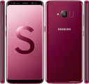
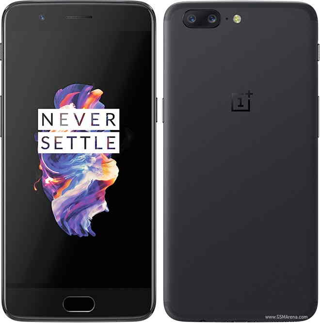
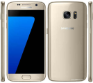
Samsung Galaxy S7 Prices
Important Note.
- All prices are in Pakistani Rupee (PKR)
- Prices may vary at stores and our effort will be to provide you with the updated prices.
- The latest price of Samsung Galaxy S7 was obtained on 17 مئی, 2019. The prices at the original stores had been updated on the respective mentioned dates.
- Find out WhatMobile price has dropped in Pakistan by selecting Notify Price Drop button
- Find out WhatMobile has better specifications by clicking Add To Compare Button find out what Mobile has better reviews by visiting our reviews section
- Find out WhatMobile is cheaper on which retailer by clicking Compare prices from retailers button
Search Terms
- Samsung Galaxy S7
Specifications
| GENERAL | |
| 2G Network | GSM 850 / 900 / 1800 / 1900 |
|---|---|
| 3G Network | HSDPA 850 / 900 / 1900 / 2100 HSDPA 850 / 900 / 1700 / 1900 / 2100 |
| 4G Network | LTE |
| Sim | Nano-SIM - Samsung Pay (Visa, MasterCard certified) |
| Announced | 05/02/2016 |
| Status | Exp. release 2016, Q1 |
| BODY | |
| Dimensions | 143.4 x 70.8 x 6.9 mm (5.65 x 2.79 x 0.27 in) |
| DISPLAY | |
| Display Size | 5.1 inches (~70.6% screen-to-body ratio) |
| Resolution | 1440 x 2560 pixels (~576 ppi pixel density) |
| MultiTouch | Yes |
| Protection | Corning Gorilla Glass 5 - Force Touch display - TouchWiz UI |
| SOUND | |
| AlertTypes | Vibration; MP3, WAV ringtones |
| LoudSpeaker | Yes |
| 3.5mm jack | Yes |
| MEMORY | |
| CardSlot | No |
| Internal | 32 GB, 4 GB RAM |
| DATA | |
| GPRS | Yes |
| EDGE | Yes |
| Speed | HSPA 42.2/5.76 Mbps, LTE Cat9 450/50 Mbps |
| WLAN | Wi-Fi 802.11 a/b/g/n/ac, dual-band, Wi-Fi Direct, hotspot |
| Blue Tooth | v4.2, A2DP, LE, apt-X |
| InfraredPort | Yes |
| NFC | Yes |
| USB | microUSB v2.0, USB Host |
| CAMERA | |
| Camera Primary | Yes, phase detection autofocus, optical image stabilization, dual-LED (dual tone) flash |
| Camera Features | Geo-tagging, touch focus, face detection, Auto HDR, panorama |
| CameraVideo | 2160p@30fps, 1080p@60fps, 720p@120fps, HDR, dual-video rec. |
| CameraSecondary | Yes, dual video call, Auto HDR |
| FEATURES | |
| Processor Cores | Octa-Core |
| OS | Android OS, v6.0 (Marshmallow) |
| CPU | Octa-core |
| Sensors | Fingerprint, accelerometer, gyro, proximity, compass, barometer, heart rate, SpO2 |
| Messaging | SMS(threaded view), MMS, Email, Push Mail, IM |
| Browser | HTML5 |
| Radio | To be confirmed |
| GPS | Yes, with A-GPS, GLONASS, BDS |
| Java | No |
| Colors | Various |
| Others | - Fast battery charging: 83% in 30 min (Quick Charge 3.0) - Wireless charging (Qi/PMA) - market dependent - ANT+ support - S-Voice natural language commands and dictation - OneDrive (115 GB cloud storage) - Active noise cancellation with dedicated mic - MP4/DivX/XviD/WMV/H.264 player - MP3/WAV/WMA/eAAC+/FLAC player - Photo/video editor - Document editor |
| BATTERY | |
| Battery | Non-removable battery |
| MISC | |
Reviews
Hands on: Samsung Galaxy S7 review
Update: More information added in about the display technology, and an explanation from Samsung as to why it got rid of the desirable 'Adoptable Storage' feature.
I sighed when I first saw the Samsung Galaxy S7 – it looks just like its predecessor, and yet again I was going to have to dig deep inside to find out whether the new features mean the new phone is worth the extra money it will cost if you choose it over 2015's Galaxy S6.
I don't know why phone manufacturers back themselves into a corner like this – giving the public a reason to criticise their new device when it actually does pack some decent upgrades.
If you look beyond the design similarities, Samsung has fixed nearly everything that was disappointing about the S6. The dropped waterproofing is back once again, with an IP68 rating. The battery has been boosted from 2550mAh to 3000mAh with little change in the dimensions. The microSD expandable memory is back.
- Read our hands-on Samsung Galaxy S7 Edge review
And you know what? The Galaxy S7 feels like a completely different phone in the hand thanks to the subtle curve on the back, taken from the Note 5. Imagine the sides from the S6 Edge's screen used on the rear, and you'll have an idea of what I mean.
However, there's nothing that will stop people seeing the Galaxy S7 as a phone that's nothing more than the Galaxy S6S, a handset with the same feature set that comes with a microSD slot – and to a degree, they'd be right.
Check out our hands-on and first impressions Galaxy S7 video:
It's now waterproof – well, I say now, but in reality this was already added into the Galaxy S5 before being stripped off to allow for the redesigned Galaxy S6. It's impressive to see a phone that's this well-crafted being able to be dunked into a glass of water – it validates what Sony's been doing for years.
Sadly there's no USB-C connector on the bottom – well, sadly for the tech fan who would have liked to easily plug in their charger either way up and enjoyed the faster speeds on offer. Less of a sad day for those of us who have approximately 4.765 billion microUSB chargers around the house.
The microSD slot will have Samsung fans cheering around the world – the reason for its disappearance in the Galaxy S6 was performance, according to the South Korean brand, which now claims to have fixed that issue, so we should see no slowdown for phones imbued with the expandable memory.
However, the brand has confusingly chosen not to use Google's Adoptable Storage feature, which was added into Android Marshmallow and enables users to 'hard code' microSD cards into the internal storage – meaning you can install massive apps onto them with ease.
Here's the statement - sent to Ars Technica - about why the system wasn't used:
"Samsung decided not to use the Android Marshmallow "adoptable storage" model. We believe that our users want a microSD card to transfer files between their phone and other devices (laptop, tablet, etc), especially the photos and videos they shoot with the camera.
"With adoptable storage, first of all the card may be erased the first time it is inserted into the device. This behavior may be unexpected by many users and we don't want our users to lose their files.
"Second, once Marshmallow starts using a card for adoptable storage, it cannot be read by other devices, so it loses this ability to be used for file transfer. Adoptable Storage is also primarily targeted towards emerging markets where devices with only 4-8GB of onboard storage are common.
"We think that our model of using microSD for mass storage is more in-line with our owner's desires and expectations for how microSD should behave."
The argument isn't invalid at all, but given the downside of Adoptable Storage is you can't swap cards in and out without confusing the phone badly, very few of us ever do that anyway.
Having lots more internal storage for a low price (a decent microSD card is a lot cheaper than jumping up gigabyte sizes in phone models) would have been a great feature, but perhaps too many people would have tried to hot swap cards and been confused.
Screen
The 5.1-inch screen is back once again, without the rumored 3D Touch-style screen that would have been a direct nod to Apple. It's the same QHD resolution that we're seeing on multiple smartphones these days (thankfully, Samsung decided to resist the chance to join Sony's insane 4K revolution) and it's still the best-looking screen on the market.
The 5.1-inch screen is as pin-sharp as ever, and even without any dedicated QHD content to take advantage of the high-res screen, web browsing and watching video is still an impressive experience. The Super AMOLED technology used inside still offers huge benefits in terms of color reproduction and contrast, so everything looks stark and clear.
I'm well aware that's something I've written for years about Samsung screens, but there's nothing that I can see that outstrips it at the moment. Even the over-saturation problems that dogged AMOLED displays in the early days have been fixed by Samsung, enabling you to choose the color level you're happy with.
Display Mate's analysis, one of the most in-depth on the web, has already been conducted on the Galaxy S7 and S7 Edge, and it found that it had not only has the screen's maximum brightness been raised significantly above last year's model, meaning it'll be easier to see in bright light, but it's got the best auto-brightness seen on any phone.
The latter is particularly important, as it means the Galaxy S7 will be able to decide how to best manage your battery while still letting you see the screen as clearly as possible.
But Samsung might have pushed too far with the tech this year, banking on it too much to introduce another key feature: the always-on display. This means exactly what it suggests: when the Galaxy S7 is in standby mode it'll show a clock, calendar or an 'image' (which is really just a weird pattern), so you won't have to constantly turn on the display to see what time it is.
Samsung promises that this won't take more than 1% of battery life per hour, thanks to being able to control every pixel of the Super AMOLED display – but that's still around 15% of your phone's juice gone per working day.
DisplayMate's findings also found that this method was very low power, drawing very little from the battery each time. I also spoke to Samsung about the issue, and Kyle Brown, Head of Product Launch Programmes for the company, said that this power drain was offset by people checking their phones up to 150 times a day for the time or to see if they have any notifications - which does make sense as a move.
It definitely makes the phone look more fancy when sitting on the desk, but it's not something that I felt was missing from my life particularly.
Battery
That said, maybe Samsung knows something that the rest of us can't know yet: that it's fixed the battery life issues that plagued its previous model.
It was one of TechRadar's Biggest Mysteries Of 2015 (TM): why the Galaxy S6 would blitz every single one of our battery tests, head and shoulders above the rest of the market in terms of gaming, video watching, web browsing and standby time - and yet would be in the danger zone by 4PM in an average working day after a few months' use.
It seems the phone would stay awake too often, apps chattering to the network and the accelerometer activating too easily. However, with the 3000mAh battery now inside we've got the biggest power pack Samsung's ever stuffed into its flagship smartphone, and combined with the more efficient Android Marshmallow we could finally see a long-lasting battery life on a top Samsung phone.
The addition of Android Marshmallow means that the Touchwiz interface, so oft-maligned by the smartphone-buying public, is again stripped back and the 'Googliness' of the phone is allowed to shine through. There's not a lot different from the S6 in reality, as the UI there was already much 'flatter' and closer to Google's Material Design.
However, the stock icons look cleaner once more, the notifications shade is starker (and white, rather neon green and grey) and the overall operation seems closer to Google's stock experience.
There are still reams of Samsung styling throughout the Galaxy S7, meaning the settings menu has loads of options to mess around with and double tapping the home button will open up the camera in a flash - overall, everything is much faster under the finger again, with a decent level of snappiness whenever you're trying to do anything. Annoyingly the multi-tasking pane still takes a beat to open, which will only get worse as the phone gets older, but that's the worst I could find.
The fingerprint scanner is present and correct once more, although I didn't get a chance to code in my digit. However, the S6 had a brilliant biometric option, so this can only get better as time goes on.
The camera user interface still remains brilliantly / infuriatingly Samsung, locked in a world of options that confuse the finger as you try and work out some of the options on offer.
The camera itself is now much improved, despite the drop in megapixel rating from 16MP to 12MP, designed to help improve low light capabilities. We don't need to have that many pixels in our smartphone cameras, and Samsung has thankfully realised that having that high a MP count in the S7 would have been pointless.
Instead, we've got 56% bigger pixels, which allow in 25% more light to get better pictures when you're out and about snapping. The results are early, but all the pics I took in the low light scenarios came out very well indeed, and sharply too.
This time last year, Samsung was droning on about 0.7 seconds auto focus as the best ever, that we didn't need anything else in the camera when trying to get a clear snap.
However, with the dual pixel sensor on board now, Samsung is NOW saying 'well, last year's phone simply wasn't fast enough', even showing side-by-side comparisons between the Galaxy S6 and S7 and the autofocus abilities.
Whatever the underlying technology, the S7 takes very quick and very sharp pictures - if you're not whirling the phone around - pause for even a millisecond, the results are impressive. It's not game-changing, but a decent refinement.
Speaking of changing games, the new Game Launcher widget on the S7 (and S7 Edge) is designed to take that experience up a notch.
You add games to the folder, and from there you're able to use Game Tools - a small icon at the side flings up an on-screen menu to let you lock the buttons, disable alerts, record your game play (with your own face in the mix) and even minimise the game so you can pop off and answer a message.
It's a nice idea and one that adds an air of legitimacy to smartphone gaming, buying into the shareable nature of how people are playing nowadays. You can even drop the resolution and framerate of games to save battery life, meaning if you're not playing something with insane graphical prowess this tool promises to save you battery.
It's not a huge element in the story of the new Galaxy, but it does add something for those that love to use their phone as an on-the-go console.
Early verdict
For all the new features above, I can't help but feel two things: the Galaxy S7 is the phone that Samsung should have made last year, and it looks just too similar to the S6.
I can't decide what it is that irks me about a phone that doesn't change in design overtly from one iteration to the next. Most people will skip generations and upgrade from a model two years ago, and if a design is popular, why step away from it?
Then again, as the 'S' models of the iPhone show, there's a definite apathy when a phone looks the same as the previous year, despite packing a load of new features in.
Samsung's fixed a lot of the problems of the S6 (in theory) here. The battery is now seemingly big enough, and should be optimised for better power management.
The camera has been tooled in the right direction - lower MP count, better pictures - and people like to look at those pics on the high res screen offered here.
The design might look the same, but the rear feels massively different in the hand, and that matters when you're holding it all the time.
But why couldn't Samsung, a brand famed for putting millions into R&D every day, have added waterproofing, a larger battery and a microSD slot to its phone last year? All these things existed in the market, so why did we have to wait a year to get them?
It could be that Samsung pushed for the minimum viable product for the price point to get the biggest profit, or it just couldn't pack all these ideas into a phone that DESPERATELY needed a design reboot - and in fairness it was one that worked.
So while this is the phone that would have crushed all in its path in 2015, there's no denying that the Samsung S7 is a welcome upgrade in the right key areas - but with the cheaper S6 on the shelves next to it, there will be many now facing a tricky choice.
Here's hoping the full review throws up some nice surprises that push the S7 further ahead in the Galaxy race Samsung is running.
Write Your Own Review
My Recent Reviews
- Be first to post review for this product.
comments powered by Disqus




-32-GB.jpg)
.jpg)
