Nokia Lumia 635 Prices
Important Note.
- All prices are in Pakistani Rupee (PKR)
- Prices may vary at stores and our effort will be to provide you with the updated prices.
- The latest price of Nokia Lumia 635 was obtained on 17 مئی, 2019. The prices at the original stores had been updated on the respective mentioned dates.
- Find out WhatMobile price has dropped in Pakistan by selecting Notify Price Drop button
- Find out WhatMobile has better specifications by clicking Add To Compare Button find out what Mobile has better reviews by visiting our reviews section
- Find out WhatMobile is cheaper on which retailer by clicking Compare prices from retailers button
Search Terms
- Nokia Lumia 635
Specifications
| GENERAL | |
| 2G Network | GSM 850 / 900 / 1800 / 1900 |
|---|---|
| 3G Network | HSDPA 850 / 900 / 2100 |
| 4G Network | LTE 800 / 1800 / 2600 |
| Sim | Micro-SIM |
| Announced | 01/04/2014 |
| Status | Available. Released 2014, June |
| BODY | |
| Dimensions | 129.5 x 66.7 x 9.2 mm, 78.5 cc (5.10 x 2.63 x 0.36 in) |
| Weight | 134 g (4.73 oz) |
| DISPLAY | |
| Display Size | 480 x 854 pixels, 4.5 inches (~218 ppi pixel density) |
| MultiTouch | Yes |
| Protection | Corning Gorilla Glass 3 - ClearBlack display |
| SOUND | |
| AlertTypes | Vibration; MP3, WAV ringtones |
| LoudSpeaker | Yes |
| 3.5mm jack | Yes |
| MEMORY | |
| CardSlot | microSD, up to 128 GB |
| Internal | 8 GB, 512 MB RAM |
| DATA | |
| GPRS | Yes |
| EDGE | Yes |
| Speed | HSDPA, 42.2 Mbps; HSUPA, 5.76 Mbps; LTE, Cat3, 50 Mbps UL, 100 Mbps DL |
| WLAN | Wi-Fi 802.11 b/g/n, DLNA, Wi-Fi hotspot |
| Blue Tooth | v4.0, A2DP |
| USB | microUSB v2.0 |
| CAMERA | |
| Camera Primary | 5 MP, 2592 ? 1944 pixels, autofocus |
| Camera Features | 1/4'' sensor size, geo-tagging, panorama |
| CameraVideo | 720p@30fps |
| CameraSecondary | NO |
| FEATURES | |
| Processor Cores | Quad-Core |
| OS | Microsoft Windows Phone 8.1 |
| CPU | Quad-core 1.2 GHz Cortex-A7 |
| Sensors | Accelerometer |
| Messaging | SMS (threaded view), MMS, Email, Push Email, IM |
| Browser | HTML5 |
| Radio | FM radio |
| GPS | Yes, with A-GPS, GLONASS |
| Java | No |
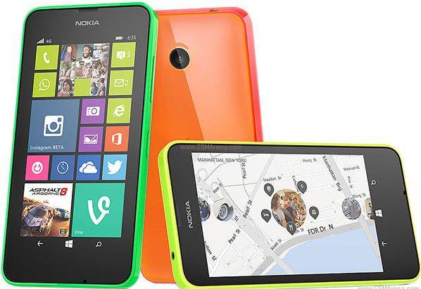
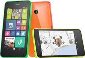
| Colors | Bright Orange, bright green, bright yellow, white, black |
| Others | - Active noise cancellation with dedicated mic - SNS integration - MP3/WAV/eAAC+/WMA player - MP4/H.264/H.263/WMV player - 7GB free SkyDrive storage - Document viewer - Video/photo editor - Voice memo/dial/commands - Predictive text input |
| BATTERY | |
| Battery | Li-Ion 1830 mAh battery (BL-5H) |
| StandBy | Up to 648 h |
| TalkTime | Up to 12 h (2G) / Up to 14 h (3G) |
| MISC | |
| SARUS | 0.97 W/kg (head) 0.77 W/kg (body) |
| SAREU | 0.75 W/kg (head) 0.79 W/kg (body) |
Reviews
Introduction
The Nokia Lumia 635 adds a sprinkling of 4G magic and external bling to the impressively solid and ultra-affordable Nokia Lumia 630. It makes a positive first impression but is its existence strictly necessary?
While Microsoft's modern Windows Phone reinvention was intended as a premium smartphone experience, Nokia has established that the low-end is where it's at for the platform.
With the Nokia Lumia 520 flying off shelves (relative to previous Windows Phone handsets at least) and now even Microsoft seeing value in affordability with the likes of the Microsoft Lumia 640 and the Microsoft Lumia 535, Windows Phone 8.1 is establishing itself as a bona fide alternative to all those cheap (and sometimes nasty) Android phones.
The Nokia Lumia 630 was one of the first to show off Nokia's vision of a classy entry-level phone, and the Nokia Lumia 635 is identical in all but three areas.
The first and perhaps most notable of those areas is its price tag. At the time of writing the Lumia 635 is available SIM free from around £85 (US$90 / AU$170) for the Lumia 635 compared to a roughly £70 (US$85 / AU$130) price tag for the 630.

That additional cost gets you 4G LTE network connectivity, as well as a glossy finish to the Lumia 635's colourful rear cover. That price bump used to be bigger, but the question remains, is it worth the extra?
Alongside these extras, the Nokia Lumia 635 offers the same 4.5-inch 854 x 480 display, the same quad-core Snapdragon 400 CPU backed by 512MB of RAM, the same 8GB of storage, and the same 5-megapixel rear camera as the 630.
In fact, it inherits pretty much all of its sibling's strengths and weaknesses.

With the average smartphone size seemingly expanding by the year, the Nokia Lumia 635 almost feels small in the hand. In fact, moving from an iPhone 5S to the Lumia 635 didn't feel like such a jolting leap as moving to something like the Nokia Lumia 1520 or the OnePlus One did.
But with a 4.5-inch display, it's small in relative terms only. In fact, I'd probably say that the Nokia Lumia 635's screen is very close to optimal in terms of the balance between single-handed usability and widescreen media clarity.
Sadly the Lumia 635's screen is not going to show your HD movies or favourite web pages in the best light. At 854 x 480, the resolution is distinctly behind the smartphone curve. The similarly priced original Motorola Moto G, for example, offers the same size of screen with a 1280 x 720 resolution.
Still, Nokia has always had a number of display tricks up its sleeve, and the Lumia 635 is no different. IPS and ClearBlack technology combine to ensure that viewing angles and outdoor legibility are above what you'd normally expect from a "cheap" smartphone.
However, I was disappointed that there was no apparent sign of Nokia's super sensitive touch display technology, meaning you can't operate the phone with gloves on. This was even present in the Nokia Lumia 520, so it's not as if it's a high-end feature.
Nor do you get the desirable tap-to-power-on option that the likes of the Nokia Lumia 1320 possessed, or the ability to glance at the time and whether you have any new notifications by hovering your finger over the display. The absence of these features is perhaps a little more understandable as Nokia strives to keep costs down on the Lumia 635.
Aside from a somewhat underwhelming display, the Nokia Lumia 635 is a pretty desirable piece of kit. Like the Nokia Lumia 630, it features a clever two-part design that almost makes it feel like one of Nokia's premium unibody constructions.
The screen, the removable battery, and all of the phone's innards for that matter are all contained within a skeletal core unit. The other part of the Lumia 635 is an extended cover, made of fairly thick plastic (or 'polycarbonate' to use the fancy official branding), which fits around the back and the sides of the device.
Once clicked into place, this is a solid device with minimal flexing or creaking. We've said it before, but no one does affordable phone design as well as Nokia.
Having said that, I didn't find the Nokia Lumia 635 to be as nice to look at or hold as the Nokia Lumia 630. It's opted for a glossy dual-layer effect, which makes it look like it's covered by a thin, clear gel layer.
While this differentiates the Lumia 635 from the 630, I preferred the latter's matte finish. Not only does it look nicer (which is admittedly subjective), it also feels nicer in the hand (which is less so). There's a certain clammy greasiness that accompanies the Lumia 635's slick finish, especially in warmer conditions.
Otherwise, the dimensions of these two Nokia Lumia phones are identical. Like the 630, the Lumia 635 weighs 134g, and measures 9.2mm thick. Not the slimmest or lightest of smartphones, then, but neither is it the bulkiest.
With identical dimensions you can swap a glossy cover for a matte finish one on the 635, so if you really can't live with the shiny shell there is an easy work around.
Button layout is as I like it for any phone over 4-inches in size (which is the vast majority these days), with both the volume and power keys located on the right-hand edge of the phone. This makes them nicely reachable when held naturally in one hand - whether you're talking right or left.
One omission that might rankle with faithful Windows Phone users is the lack of a dedicated camera button. In previous phones this would grant point-and-shoot-like two-stage control over your shots, not to mention reliable snaps when in a rush or shooting from an awkward position.
It would also grant the quickest and most reliable shortcut to the camera app possible. It was missed here, but it's one more element that's been sacrificed in the name of cost cutting, and it's an understandable one.
Nokia has included a microSD card slot in the Lumia 635, which is a good job given the scant 8GB available internally. You'll need to remove both the rear cover and the battery to access this port, though, just as you do with the microSIM slot.
Key features
The Nokia Lumia 635's stand-out feature has to be 4G. Unlike its sister the Nokia Lumia 630, the Lumia 635 can connect to the UK's fastest LTE mobile networks.

I took the Lumia 635 for a spin in a 4G-equipped town, and sure enough, I comfortably attained broadband-like download speeds without so much as a sniff of Wi-Fi.
Even with only two 4G signal bars showing out of a potential five, a quick Speedtest.net test yielded download and upload speeds of around 4Mbps either way.
So the Nokia Lumia 635 is automatically a good choice for those who are intent on capitalising on the fastest connection speeds currently available, but who don't want to pay the earth for the privilege.
It's worth noting that 4G contracts tend to come at a premium, so if you value fast network speeds over class-leading hardware, the Lumia 635 could be your phone.
That's not the Nokia Lumia 635's only stand-out feature though. Following closely on the coattails of the Nokia Lumia 630, the 635 was only the second smartphone to ship with Windows Phone 8.1 as standard.

I'll discuss the ins and outs of the latest Microsoft mobile OS in the next section, suffice to say that it's a notable (if not wholesale) improvement over Windows Phone 8.
In particular, you finally get the notification menu that we've been crying out for since Windows Phone 7 launched, and which Android and iOS adopted some time ago.
You also get a Swype-like keyboard that allows you to type out messages by sliding your thumb from letter to letter. Again, this is a feature that has been on Android for some time, while iOS is lagging behind. Regardless, we're glad it's here on Windows Phone now.
However Windows Phone 8.1 has since arrived on the majority of Windows Phone handsets, so while this was a big selling point at launch it's less so now.
Still, that Nokia and Microsoft would make these two budget phones the first to receive such a major update says a lot about how important they are to both companies.
One final key feature I should talk about is that removable rear panel. Nokia has always been good at providing alternative covers for its phones, and that's certainly the case with Nokia Lumia 635.
Share my distaste for the glossy finish? Just purchase a new one and swap it around.
Interface and performance
If you've used a Windows Phone device before, then the Nokia Lumia 635 will feel familiar to you.

You get the same rigid two-homescreen layout, with the first dedicated to widget-like Live Tiles that provide you with key information at a glance (such as freshly taken photos, or news headlines), and the second showing you a simple list of installed applications.
Familiar, then. But not identical.
For while Nokia hasn't modified Microsoft's OS at all (beyond a few additional settings and stock apps), when it launched this was one of only two smartphones to run Windows Phone 8.1. It's a subtle update from WP 8, but it does bring some notable additions.
As mentioned in the previous section, the most noteworthy addition here is Action Centre, which is the name Microsoft has given to Windows Phone 8.1's long-awaited notification menu.
Now, when you drag down from the top of the screen from within any app, an overlay will drop down detailing your latest unread notifications. Emails, SMS messages, social network posts, app updates, downloads - anything you need to know about will be in here.

Tapping each notification will jump you to the appropriate app, while a swipe will dismiss it from view.
Notifications aren't the only thing you'll find in Microsoft's new Action Centre. You also get some handy shortcuts for commonly-used functions. By default this includes Wi-Fi, Bluetooth, and screen brightness toggles, as well as a camera shortcut (handy given the lack of a physical camera button).
These can be swapped out and customised in the settings menu, so you can add a rotation lock toggle, a flight mode shortcut, or a range of other functions.
Talking of the settings menu, Action Centre also provides a shortcut to this vital hub. Indeed, it felt like I spent a little too much time in this settings menu, and it was slightly overloaded with options that were difficult to sift through and differentiate.

Of course, such tweaking shouldn't be necessary for the average casual user, and Windows Phone has never been more usable outside than it is here.
A large part of that is down to Action Centre, but there's also a neat lock screen that helps. Once again you have to dive into that murky settings menu to get it running to its full potential, but once you do you can set the background image to reflect the weather or your Facebook account, to name but two options.
You can also choose an app from which to show a detailed status, such as your latest email, and to show artist information when playing music.
Also new to Windows Phone 8.1 is an improved keyboard. It still looks much like the stock (and non-swappable) Windows Phone keyboard of old, but it now comes with the addition of Word Flow.
If you've ever used Swype or SwiftKey Flow on Android, you'll know what this means. You can type out words by sliding your thumb between letters, with spaces entered when you remove your finger from the screen.
It can be extremely quick to type out words in this way, once you grow accustomed to it, and it's more reliable when trying to type one handed whilst walking along. It's a welcome addition, though with Apple unexpectedly joining Android in relenting to demands for third party keyboard support in iOS 8, it's in danger of looking like a token gesture on Microsoft's part.
Since launching, the Nokia Lumia 635 has been updated to Lumia Denim, which lets you make use of Cortana, Microsoft's virtual assistant, which can answer your questions, launch apps and carry out other tasks, just like Google Now or Siri.
Among other minor tweaks and additions Lumia Denim also added Live Folders, so you can group apps together on the home screen.

General navigation through Windows Phone 8.1's menus on the Nokia Lumia 635 was predictably smooth. There were no stutters at all when flitting between the home screens and scrolling down through my Live Tiles, which is what I've come to expect from Nokia and Microsoft's joint efforts.
Where I did notice performance issues was in more intensive tasks, such as when installing or updating multiple apps, which caused significant (though temporary) freeze-ups.
Jumping into the camera, too, takes longer than I would like.
You might initially be surprised at this when you consider the Lumia 635's hardware. While it only runs on a relatively modest 1.2GHz processor, it is a quad-core Snapdragon 400 unit.

This somewhat sluggish performance was reflected in my benchmark tests. An average WP Bench score of 255.45 is significantly slower than that of the Nokia Lumia 1320 at 312.22.
The Lumia 1320 runs on a dual-core variant of the same Snapdragon 400 chip - albeit one that's clocked 500MHz faster, suggesting that the Windows Phone OS perhaps continues to be optimised for raw clock speed over multi-core cleverness.
Of course, a more likely culprit in all of these performance issues is the Nokia Lumia 635's 512MB of RAM, which is half that of the aforementioned Lumia 1320.
It has an effect on game playing too. Taking Asphalt 8 for spin, while general performance was okay, there were periodic stutters to both the frame rate and the soundtrack - a sure sign that the Lumia 635 is straining against memory limitations.
Of course, when placed against Nokia's older budget phones like the Lumia 520 and the Lumia 620, the Nokia Lumia 635 comes out on top thanks to its stronger processor.
When viewed in this entry-level context, it's a decent little runner. Just don't expect a premium, completely uncompromised Windows Phone 8.1 experience and bear in mind that there are newer yet still quite affordable Lumia's now, such as the Microsoft Lumia 640, which has 1GB of RAM.
Battery life and the essentials
Battery life
As with the Nokia Lumia 630, the Nokia Lumia 635 is powered by an 1830mAh battery. It's more than enough for a smartphone with such modest specs.
Having said that, the standard TechRadar battery test yielded some surprising results. I ran our usual 90 minute 720p video with all notifications on and screen brightness set to maximum.

The result was an average of 71 percent remaining battery life, which doesn't sound particularly great. Indeed, it's not, and what's more it's a good six percent less than the Nokia Lumia 630 managed.
"Aha," you're probably saying. "That's because it's 4G."
Nice idea, but when I ran the tests I was in a 3G area. So why the discrepancy? I honestly have no idea. Maybe there's something in the Lumia 635's different network chip that requires more juice.
Still, that's a pretty specific battery stress test. In general usage, which included dealing with emails and messages, a little light gaming, fielding and making a few calls, checking a few websites and taking a handful of camera snaps, the Nokia Lumia 635 comfortably made it through the day.

Nokia's official figures reflect that, with 14 hours 3G talk time, 12 hours of 2G talk time, and 58 hours of music playback.
Windows Phone 8.1 also includes the latest version of Battery Saver, which is a stand-alone app that allows you to monitor and adjust power usage settings.
For example, you can spot a particularly power-hungry app and opt to turn off its ability to run in the background.
You can also opt to save battery life by cutting down on such background processes whenever battery life gets low, or until the next charge.
These are all handy features for extending the Lumia 635's life when caught short.
The essentials
Microsoft's Windows Phone OS isn't readily customisable like Android, so the Nokia Lumia 635 doesn't offer up any software surprises - especially as we've already seen this particular Windows Phone 8.1 configuration in the Nokia Lumia 630.
Naturally, as a Lumia device, you get Nokia (or now Microsoft's) own custom apps such as Lumia Camera in place of the stock Windows Phone camera app (though you can switch between the two). You also get HERE Maps and HERE Drive, which are two of better navigation apps to be found on any platform.
While they're perhaps not as immediately familiar or intuitive as Google Maps, both have the distinct advantage off allowing you to preload maps for offline usage.

In the case of HERE Drive, in particular, this makes for a genuine sat nav replacement. That's not to be sniffed at.
For web browsing, Windows Phone 8.1 comes with Internet Explorer 11. Unsurprisingly, it's much the same as Internet Explorer 10 for Windows Phone 8, with its topsy-turvy universal address bar configuration (it's on the bottom rather than the top which actually makes a certain amount of sense) and severely stripped-back style.
New to version 11 is InPrivate browsing, which lets you set up a private browsing session from the Tabs menu. No data is stored or shared in these private sessions. It's not the first web browser to do so, but it's a welcome feature nonetheless.
Another nice-but-hardly-original addition is Reading View. Tap the book icon that appears in the address box when a web page loads, and it will switch to a stripped-out, mobile-optimised view. It makes standard web content that much more readable, and on a phone like the Lumia 635 with its less-than-sharp display, that's a big plus.

Talking of tabs, you can now have more than six of the things open at once. There's also great synchronicity with Windows 8, better web search predictions, and the option to save rather than open downloaded files.
In terms of general performance, Internet Explorer 11 on the Nokia Lumia 635 keeps up with its rivals on other platforms. The full TechRadar web page loaded up fully in around 10 seconds, which is a strong result.
However, I'd recommend keeping the default mobile website bias in place, as viewing desktop websites on that low-res 4.5-inch display isn't pretty.
Besides the aforementioned Battery Saver, Windows Phone 8.1 also includes Data Sense and Storage Sense. These allow you to customise settings aimed at optimising your data allowance and physical storage respectively.

Given that the Nokia Lumia 635 is aimed at those on a tight budget, who will likely be on low-cost contracts, and who probably won't be splashing out on a 128GB microSD card (yes, they're supported!), these are particularly noteworthy features.
Call quality during my time with the Nokia Lumia 635 was strong. You can always rely on Nokia to remember that these are phones first and foremost. Connections were consistently stable and voice quality was loud and clear, if a little harsher than on a high-end phone like the iPhone 6.
Microsoft's People app is a colourful way to deal with your contacts, as always, though there continues to be an issue with contact duplication.
I've noted before that this is the case when implementing your Facebook contacts, but I found it with Gmail too. There seems to be some kind of HTC-like contact-linking feature to help cut down on all those irritating doubles, but for some reason it lets certain examples slip through the net.
That aside, I continue to appreciate the ability to scroll right from your contacts list to view a social network hub, summarising your contacts' latest posts on Facebook, LinkedIn, and the like.
Camera
The Nokia Lumia 635's camera offering seems pretty weak at an initial glance. The main rear snapper is a basic 5-megapixel offering with no flash whatsoever, so night shots are out.
But do you know what? The Lumia 635 is capable of taking some surprisingly decent shots. I'm not saying it's anything to write home about, particularly, and there's certainly nothing here that warrants the PureView label of Nokia's high-end cameraphones.
But this is a pretty well balanced smartphone camera for the price, and it's certainly better than the vast majority of low-end Android phones that pass through our doors.
Scenery snaps picked out the clouds surprisingly well, though the darkened foreground revealed the need for a HDR mode, which has since been added with the Lumia Denim update. Meanwhile close-up shots of flowers revealed reasonably sharp edges and accurate colours.
Finally, low-light indoor shots were distinctly less grainy than many of those aforementioned cheap Android efforts can manage.
More problematic for our money is the total lack of a front-facing camera. That means no video calls from the preinstalled Skype app, but more importantly, given the likely target audience, no selfies.
With that cheap price tag and gaudy design, the Lumia 635 is clearly going to be an appealing choice to kids - or at least to parents footing the bill for their kid's new phone. So omitting the facilitator for one of the key things kids do with their phones these days seems a little strange to say the least.

Video recording on that rear camera is a bit of a weakness. It's 720p, but pretty much all of our test videos had an element of shake and blurriness to them, while it didn't react too swiftly to changes in lighting conditions.
On the software front, the Lumia Camera app is as intuitive as always, but it doesn't have a lot to work with here. There are settings for white balance, ISO, exposure and the like, but there aren't any funky filters or settings beyond Smart Sequence.
The latter takes a series of quick-fire photos and lets you form a single perfect photo from them, doing things like removing moving objects, changing faces (perfect for group or family photos), or simply picking the best shot.

Click here for the full res image

Click here for the full res image

Click here for the full res image

Click here for the full res image

Click here for the full res image
Media
Microsoft has finally reached a point with Windows Phone where it's offering a reasonably rounded media experience, and the Nokia Lumia 635 benefits from that.

In Xbox Video, Windows Phone at last has a video content store to call its own. It contains a pretty comprehensive library of TV shows and movies to rent or own at competitive prices.
This stand-alone video app forms one half of the replacement for the old music and video app. The other half, you'll be unsurprised to hear, is called Music.
Again, this is fairly complete store for music tracks, though there's not much of a storefront. You kind of have to know what you're looking for here.
Of course, Nokia provides its own means of music discovery in the form of MixRadio. This app provides free curated playlists built around certain themes. These can be based on genre, moods, or events like festivals. Each playlist can be downloaded for offline listening, too.

You can also create personalised mixes by feeding up to three artists into the app, which will then spit out a bunch of related tracks. You can't specify particular artists to play, and you're limited to six skips per hour, but as a free music discovery tool (with no sign-up required), it's hard to complain.
So Microsoft's media ecosystem has finally matured. We're not sure the Lumia 635 is necessarily the best handset to exploit that fact, though.
Its 4.5-inch display is large enough for videos, but again, that 854 x 480 resolution isn't quite sharp enough to show it in all its HD glory. SD material fares better, of course.
The same goes for gaming, which I touched upon in the performance section. While the Lumia 635's quad-core Snapdragon 400 CPU can just about run everything the Xbox Live app has to offer, it won't look at its best on the display. Still, for the price, you have yourself an adequate gaming machine.
Comparison
Motorola Moto E (2015)
If there's one company which can deliver as impressive low cost phones as Nokia and now Microsoft it's Motorola, and the Moto E (2015) is one of its most affordable yet at around £90 SIM free.
It's perhaps the closest Android competitor to the Lumia 635 too, with 4G support, a 1.2GHz quad-core processor, a 5MP camera and a 4.5-inch screen.
Yet it trumps Nokia's offering in a number of ways. For one thing that screen is a little sharper at 540 x 960. The Moto E also has twice as much RAM (1GB) and a VGA front-facing camera, which isn't up to much but is a whole lot better than no front-facing snapper.
However it's also ever so slightly more expensive than the Lumia 635 and for better or worse it runs Android 5.1, not Windows Phone 8.1.
Microsoft Lumia 435
The Microsoft Lumia 435 is the first 400-class device in the Lumia range and as such you won't be surprised to hear that it's one of the cheapest at around £55 SIM free.
That makes it significantly cheaper than even the Lumia 635 yet surprisingly it's actually better in some ways, with a front-facing camera and 1GB of RAM rather than 512MB.
But inevitably a number of sacrifices had to be made to achieve that price point. There's no 4G for one and it only has a dual-core processor. It's also got a smaller 4.0-inch screen and a weak 2MP rear camera.
Despite losing out in a couple of ways the Lumia 635 is clearly a better phone then, but it's hard to argue that the Lumia 435 isn't good value for money.
Microsoft Lumia 640
If you can break the £100 barrier then the Microsoft Lumia 640 is a worthy alternative to the Nokia Lumia 635. It's newer and at around £130 SIM free it's significantly more expensive, but it still falls into the low end of the market.
There's a lot to like about it too, with an impressive 5.0-inch 720 x 1280 display, a long-lasting battery and a decent 8MP camera.

It supports 4G as well, so price aside it's an equal or better phone than the Lumia 635 in just about every sense, though in most areas it's only a modest upgrade.
It's undoubtedly worth the money, but if you're on a tight budget you won't miss out on much by choosing the cheaper Lumia 635.
EE Harrier Mini
The EE Harrier Mini is the successor to the surprisingly accomplished EE Kestrel and with a price tag of just under £100, coupled with 4G connectivity and Wi-Fi Calling, it's a tempting little phone.
It's locked to EE of course, which could be a deal breaker right there, but if it's not you can look forward to a respectable 4.7-inch 720 x 1280 display, an 8MP camera and a near stock version of Android 5.0.

That leaves it with a clean, uncluttered and intuitive interface, which you can customise to your liking while dealing with minimal manufacturer bloat.
Its performance sometimes feels a little lacking (though on paper it's actually slightly more powerful than the Nokia Lumia 635) and the 635 is a little cheaper, but it's a good option if you want stock Android on a budget, especially if you're already an EE customer.
Verdict
The Nokia Lumia 635 adds 4G connectivity to the already decent Nokia Lumia 630 package. But it also adds an extra bit to the price tag, which is a considerable amount at this entry level.
That brings the Lumia 635 within range of far better-equipped Android phones, and makes it less easy to recommend.
We liked
The Nokia Lumia 635 is all about offering 4G connectivity at a low price, and it does that with Nokia's customary entry-level flair.
As only the second phone to ship with Windows Phone 8.1 out of the box, the Lumia 635 had a certain feeling of importance and exclusivity. That's since worn off, but the new OS itself brings some notable improvements like Action Centre.
While similarly priced Android phones may have better specs, none have the premium feel and general cohesiveness of this Nokia effort.
We disliked
The addition of 4G has nudged the Lumia 635's price up a little, but as a percentage of the Nokia Lumia 630's price it's quite considerable.
Now pitched up against a range of more powerful Android phones, the Lumia 635 is trickier to recommend.
I also can't fathom why Nokia has left off a front-facing camera. Given the youth audience the Lumia 635 is likely aimed at, taking away the ability to take selfies seems like quite the oversight.
Verdict
The Nokia Lumia 635 is nigh-on identical to the Nokia Lumia 630, only with the addition of 4G connectivity. But the resultant bump up in price carries things in the wrong direction.
All of a sudden, comparisons to similarly priced Android phones become less flattering, and a case for buying the Lumia 635 becomes tougher to make.
The Lumia 635 remains a decent all-round phone, though, with a level of build quality that outshines anything else at this price point and a fresh new Windows Phone 8.1 OS.
First reviewed: July 2014
Write Your Own Review
My Recent Reviews
- Be first to post review for this product.
comments powered by Disqus






-32-GB.jpg)
-64-GB.jpg)

