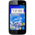
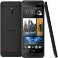
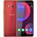
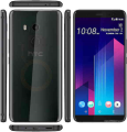
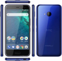
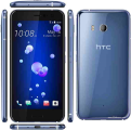
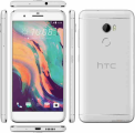
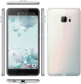
HTC One (E8) Prices
Important Note.
- All prices are in Pakistani Rupee (PKR)
- Prices may vary at stores and our effort will be to provide you with the updated prices.
- The latest price of HTC One (E8) was obtained on 17 مئی, 2019. The prices at the original stores had been updated on the respective mentioned dates.
- Find out WhatMobile price has dropped in Pakistan by selecting Notify Price Drop button
- Find out WhatMobile has better specifications by clicking Add To Compare Button find out what Mobile has better reviews by visiting our reviews section
- Find out WhatMobile is cheaper on which retailer by clicking Compare prices from retailers button
Search Terms
- HTC One (E8)
Specifications
| GENERAL | |
| 2G Network | GSM 850 / 900 / 1800 / 1900 - SIM 1 & SIM 2 |
|---|---|
| 3G Network | HSDPA 850 / 900 / 1900 / 2100 HSDPA 850 / 1900 / 2100 - for India |
| 4G Network | LTE LTE 1800 / 2100 / 2500 - for India |
| Sim | Dual SIM (Nano-SIM, dual stand-by) |
| Announced | 01/06/2014 |
| Status | Available. Released 2014, June |
| BODY | |
| Dimensions | 146.4 x 70.7 x 9.9 mm (5.76 x 2.78 x 0.39 in) |
| Weight | 145 g (5.11 oz) |
| DISPLAY | |
| Display Size | 1080 x 1920 pixels, 5.0 inches (~441 ppi pixel density) |
| MultiTouch | Yes |
| Protection | Corning Gorilla Glass 3 - HTC Sense 6 UI |
| SOUND | |
| AlertTypes | Vibration, MP3, WAV ringtones |
| LoudSpeaker | Yes, with stereo speakers, built-in amplifiers |
| 3.5mm jack | Yes |
| MEMORY | |
| CardSlot | microSD, up to 128 GB |
| Internal | 16 GB, 2 GB RAM |
| DATA | |
| GPRS | Yes |
| EDGE | Yes |
| Speed | HSDPA, 42.2 Mbps; HSUPA, 5.76 Mbps; LTE, Cat4, 50 Mbps UL, 150 Mbps DL |
| WLAN | Wi-Fi 802.11 a/b/g/n, dual-band, Wi-Fi Direct, DLNA, Wi-Fi hotspot |
| Blue Tooth | v4.0, A2DP |
| NFC | Yes |
| USB | microUSB v2.0 |
| CAMERA | |
| Camera Primary | 13 MP, 4128 x 3096 pixels, autofocus, LED flash |
| Camera Features | Geo-tagging, touch focus, face detection, panorama, HDR |
| CameraVideo | 1080p@30fps |
| CameraSecondary | 5 MP, 1080p |
| FEATURES | |
| Processor Cores | Quad-Core |
| OS | Android OS, v4.4.2 (KitKat) |
| CPU | Quad-core 2.5 GHz Krait 400 |
| Sensors | Accelerometer, gyro, proximity, compass, barometer |
| Messaging | SMS (threaded view), MMS, Email, Push Email |
| Browser | HTML5 |
| Radio | TBD |
| GPS | Yes, with A-GPS, GLONASS |
| Java | Yes, via Java MIDP emulator |
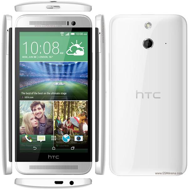
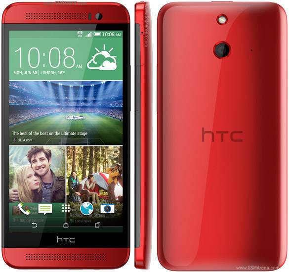
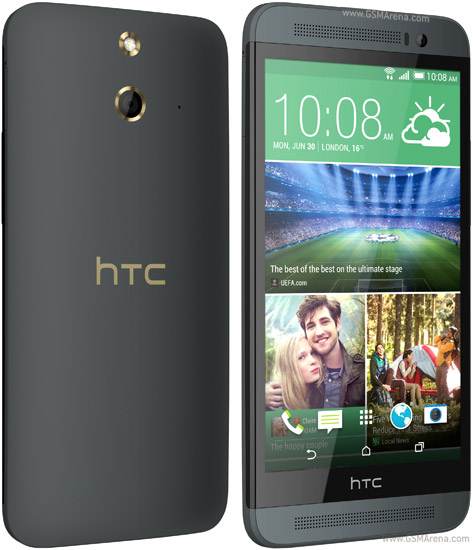
| Colors | White, red, black |
| Others | - SNS integration - Google Drive (50 GB cloud storage) - Active noise cancellation with dedicated mic - MP4/H.263/H.264/WMV player - MP3/eAAC+/WAV/WMA player - Google Search, Maps, Gmail, YouTube, Calendar, Google Talk - Organizer - Document viewer - Photo viewer/editor - Voice memo/dial/commands - Predictive text input |
| BATTERY | |
| Battery | Non-removable Li-Po 2600 mAh battery |
| StandBy | (2G) / Up to 504 h (3G) |
| TalkTime | (2G) / Up to 26 h 40 min (3G) |
| MISC | |
Reviews

Introduction and key features
The HTC One E8 is the phone I never thought I'd see. Given HTC's big push into making design the most important element of its flagship One M8 phone, why lose it?
And this theme returns when you turn the phone over: all the talk of the importance of the duo camera, with Ufocus and other assorted Ultrapixel gubbins, is gone in favour of an off-the-shelf 13MP sensor.
What gives, HTC? It's nearly 30% cheaper? Oh. That makes sense.
Beyond that, we're treated to the HTC One M8 spec for spec. That means a Snapdragon 801 chip inside, the same larger 2600mAh battery, a glorious Full HD 5-inch Super LCD3 screen, a microSD slot and, well, you might as well just read the spec sheet for the One M8 to get the full picture.
Oh - the IR blaster on the top is gone. That's important if you like the thought of controlling your TV with a phone.
The key question here is whether or not you'll be able to buy it. It's not a lot of good thinking about this as your next prospective phone when it might not be available in your country.
-420-90.jpg)
Annoyingly HTC is being a little cagey about this fact – so I'm not sure if it will be coming to the UK, US or Australia any time soon, and even the third party retailers, usually the treasure trove of underground handsets, have nothing to report.
So that presents a problem – but there are always ways to get your hands on one. So that begets the next question: by taking away the metal design, the reason for the HTC One M8 to enamour so many, has the company taken away the soul of an award winning phone and created a zombie version to just shift more units?
-420-90.jpg)
Will the plastic design cause users to remain disinterested in the HTC brand, causing fewer to buy in the future?
Plastic back
So, let's get down to it: how does the new polycarbonate cladding feel in the hand? I was sent the Electric Crimson version of the phone to test out (come on, if that's an option on the list to choose, it was impossible to go for anything else) and it's a shiny plastic, rather than the matte grey finish.
This means it's as slippy, if not even less grippable, than the metal of the One M8, although if you plump for the matte version (rather than the gloss on test here) you'll be able to hold onto it a little better.
The plastic back feels solid, makes the phone lighter and, as I said, dispenses with the IR blaster on the top, which has the effect of moving the power button to the centre. It's a slightly odd place to put it, but it's easy to hit and still raised.
-420-90.jpg)
It's intriguingly the same design as seen on the original HTC One... well, intriguing if you've got nothing else to think about.
The volume key on the right-hand side is also plastic, as you'd expect, and probably feels like the cheapest part of the phone. I'm not a fan of the lighter chassis, as I loved the great balance of the One M8, but the One E8 will probably appeal to those looking to spend less without losing the unibody package experience.
I oddly didn't mind the plastic casing of the E8, despite going into the review thinking that would be the biggest problem. Some commenters have claimed that all phone reviewers only ever like metal phones, which simply isn't true. I like well-designed phones and you do too.
For instance, the Nokia Lumia 930 is mostly plastic, but retains a metal rim to add a touch of class. The LG G2 was all plastic, but the unibody design felt solid and impressive. Even Samsung's Galaxy S5 is the most sturdy of the interstellar range, but the faux-chrome outer and removable back mean you can feel the hollow nature of the phone.
-420-90.jpg)
It's the same as the LG G3 – a phone that looks metal and has all the removable battery and microSD slots people crave. But hold it and you can tell the back comes off, as there's a slight flex and lightness that ruins the ergonomics.
So is the HTC One E8 terribly designed as a result of being plastic? No – like the iPhone 5C, it retains a sense a fun and the colours really add to the mix. It's a good enough trade off if you want the HTC UI but can't afford the M8… although with the Duo Camera gone too, you'll have to REALLY want the Sense UI and Boomsound speakers… and I don't think enough people will be after that.
No IR
Is the lack of an infra-red port, the thing that lets you control your TV with your phone, a big loss to the phone? Well, apart from making the aesthetic of the One E8 a little less sumptuous, it's barely missed.
I keep pointing out that holding your phone like a remote control is impossible as you're missing the tactility of the buttons, but apart from LG with the G Flex (which had the sensor on the back, meaning you could hold the phone up to see what you're pressing) nobody has done anything about it.
The disappearance might irk some, but in reality it wouldn't be missed on the One M8.
Lower price
As mentioned above, the main reason for losing many of the good bits of the One M8 on the E8 is the price drop, and it's pretty big considering.
If it ever launches in developed smartphones markets, it should be around 30% cheaper than the One M8 (according to Russian price disparity, which is one of the few places you can currently pick this phone up).
-420-90.jpg)
So if you get your hands on the One E8 (and that's a big if, as HTC has yet to confirm availability in the more premium smartphone markets, focusing the E8 in other more developing parts of the world) you'll be paying a lot less.
It's hard to say whether this is the right move - it depends if the One M8 and E8 will be sold side by side. If they are, then it's a cannibalisation exercise. People won't want to pay that much more for a metal back and two cameras, and it could harm the sales of the One M8 as a result.
Also, where does the One Mini 2 fit into the equation? Or the Desire 816? For a company that was planning to make fewer phones, HTC is certainly churning out the handsets.
Upgraded camera
Here's something that will confuse a lot of people if the two phones are placed side by side in a shop: the camera on the HTC One E8 is going to be a 13MP affair, with single flash LED rather than the all-singing One M8, with its Duo Camera and Ultrapixels and Ufocus background defocus.
The 13MP snapper here has all the power and toys the One M8 has (bar the defocus post processing) so you can take Zoes, HDR shots, videos and more without a problem.
-420-90.jpg)
The front facing camera isn't the same as found on the One M8, as it's not got the wide angle effect – so it's the same one as seen on the One Mini 2 and the Desire 816 – but that doesn't mean this isn't a strong phone if you like to take loads of self portraits.
But the back camera looks great still, and the sharpness from the off the shelf sensor seems to be very good indeed.
Motion launch
In terms of bringing the toys from the One M8 to the E8, the one I'm most glad to see it Motion Launch - mostly from a muscle memory point of view.
This option allows you to double tap the screen to wake the phone (as long as you've moved it and activated the accelerometer, meaning you won't be able to use it when the phone is placed on a desk) and gain instant access to the time and the quick widgets in the lock screen.
(Side note: even picking it up and moving it around, the double tap screen unlock fails to work on occasion. It's like the One E8 can't always get its accelerometer to work).
But that might be a little bit too simple for some people - what if you want to wake the phone properly, or go into the Blinkfeed view? Perhaps you want to start the camera from cold?

The good news is all this is possible: swipe from the left or right, even with the screen off, and the One E8 is always ready to open up the home screen or Blinkfeed respectively. It's a neat trick and one that I find myself using more and more.
You can always tell when something is a good idea when I do the same thing on other phones - and that's the case here.
Sadly, there's something I'll never use: holding the volume down key and turning the phone on its side to wake the camera. It just doesn't work regularly, which leads to frustration and feeling like the phone doesn't work as well as it should.
You can just turn on the screen with a double tap and flick the camera icon to do the same thing - and this works much, much more quickly.
HTC has put a couple of other 'swipe commands' into the mix, with swiping down from the top activating voice dialler (good for in car) and from the bottom for Google Now.
I'd much rather be able to customise these to my own commands, but that's not possible for now.
Boomsound
Given the cut-down-but-powerful nature of the One E8, I'd have not been surprised to see the BoomSound speakers, which flank the screen at the top and bottom, be cast aside too, given they need extra circuitry and chips to work.
But they're here, and they're still as bass-rich and powerful as before. I can't be sure, as it's hard to really tell the difference when the components aren't the same, but the plastic housing doesn't seem to give quite as clear a sound as the metal one does, which would make sense from a physics point of view.
-420-90.jpg)
Don't let that put you off though - the speakers are still one of the most stunning things about HTC phones, and frequently something I'll turn on to impress others.
Even playing a driving game is a much more delightful experience with BoomSound, as it means that the engine notes, the rich throttle sounds and brake squeals are brought to life in a way that you don't get if you're getting all the sound pumped out of the back of a tiny speaker.
Do you need BoomSound in day to day life? Not at all. It's certainly a luxury, but one that when you do use it, you'll be glad it's there.
Interface and Performance
The HTC One E8 is based largely on the same prowess and internal structure as the M8 – in fact, cameras aside, the two are identical.
This means that everything I noted in the longer, in-depth review of the HTC One M8 is applicable here, so if you want to get the real deep dive, then here's the link to the interface section of that piece.
However, if you've not come across the UI before, or only want to know about it from a top level point of view, here are my main findings during the review period with the HTC One E8.
The main thing about the Sense UI is that it's one of the more masking skins that sits on top of Android. This means that it's a lot different to the experience on something like the Nexus 5, which runs naked, raw Android from Google, and instead gives something of HTC's identity.

The main feature is Blinkfeed, which gives instant access to a variety of topics and services, with a number of news outlets serviced as well as social networking information built right into the Windows Phone-a-like tiled interface.
It's simple and has been refined over the last year, but it's still something I have to remind myself to use from time to time.
That said, when I do remember it, I'll generally get a couple of decent news stories out of it to browse, so it's a long way from useless.
There's a weird gremlin in the Facebook app though – you'll sometimes have to click a story twice to get taken to the right page (rather than your news feed), which is to do with confused permissions from the Facebook server it seems. It can be righted, but it's easier to click twice.

The rest of the interface mimics Android, but looks a lot different. There's still the app drawer (although it cycles downwards and can be customised between simple mode, with fewer icons, or more apps to make use of the 1080p screen) and the notifications bar is as powerful as ever.
Swipe down with one finger, and get to the updates to your daily life, through messages, calendar and other notifications. Swipe with two and get quick access to settings you need to turn on and off swiftly; Wi-Fi, Bluetooth and mobile data, for instance.
For the most part, the interface from HTC is smart and simple to use, if a little overbearing for anyone that's a fan of rawer Android. What it does do is provide HTC with identity in a convoluted Android world, with so many phones trying to do the same thing.
Performance
Given HTC has put the same Snapdragon 801 processor under the hood of the One E8, the ability to fire well under any input is understandably good.
Apps barely lagged at all for anything I wanted to do, and the good thing is that the same optimisation for heavier games seems to be present and correct.

It's unclear (OK, maybe not) whether HTC has optimised the benchmarks again, allowing the phone to enter a higher-power mode when being subjected to tests in order to gain favour among those looking to have the most efficient and powerful device.
But the results remain the same (to within a very fine degree on our Geekbench testing) meaning that the phones just work exactly the same way.
Either way, it's good news for any prospective buyer as it means you'll be getting a phone that can handle most apps with aplomb.
Battery and the essentials
The battery performance of the HTC One E8 is pretty good indeed – perhaps not at the level of the other phones on the market (the Samsung Galaxy S5 is one of the better ones around, for instance) but it still performs remarkably well during testing.
The Extreme Power Saving Mode, enabled by the chipset, is once again in force, meaning that when you get into a situation where the battery is nearly dead, you can enable it to shut the phone down to all but the most rudimentary tasks, such as calling, text and a teeny bit of web browsing.
The mode isn't designed to give stellar battery life for all time – rather it's meant to be something you use in an emergency, or when you've got a night out after work and can't find your charger.
You know, life or death situations.
It's not perfect though. If you still use the phone at all, the battery will stop drop too fast, but if you want a long-lasting phone on standby, this mode will make the phone icy cold.

Running the standard TechRadar battery test, I found that once again things were acceptable from a media standpoint – this isn't going to be the best phone for watching a movie and getting on with your day, with a significant chunk of battery going to firing up the Super LCD display, but it's a long way from where it was just a year ago, meaning you've got a much leaner media machine under your grasp here.
The essentials
The HTC One E8 follows its metal clad brother in a number of ways, but actually outperforms the M8 in terms of call quality, it seems.
While it's hard to actually quantify, due to not being able to place the same SIM in the two phones at once, I found that in my house, which is a notoriously tricky spot to get any kind of signal, the connection on the One E8 seemed to be superior.
In terms of actual use day to day, the only difference between the E8 and the One M8 is that the phone is slightly harder to hold in the plastic version (if you've gone for the glossy one, that is) but it's nothing to really worry about.

The on screen keyboard is still one of the best on the market from an OEM (although I still rate options like Swiftkey over the inbuilt one here, simply for better word prediction) and the messaging methods are plentiful and mostly well-integrated.
If you want to read more about this – be it the call quality, options during a call, the messaging options or the internet browsing capabilities – then check out that section of the main M8 review to get your fix.
That said, I would like to talk up the screen again, even though it is the same one as found in the One M8. If you're using this phone to browse the internet, the 5-inch display is more than good enough – in fact, it's pin sharp with good colour reproduction to get you right what you need into your eyeballs.
You're now free to go and read more about this in the One M8 review – but you know me, always want to make sure those that hate clicking get the highlights.
Camera
The camera on the HTC One E8 is one of the biggest areas where the Taiwanese brand has decided to drop the component quality in order to bring the cost of the phone down to a more palatable level.
The confusing thing for consumers, as I've mentioned already, is that the camera on the back seems to be more powerful, given it's a 13MP option rather than the much-hyped Ultrapixel Duo Camera that HTC has been pushing on the M8.
-420-90.jpg)
This means that while you get clearer snaps, in theory they'll look less well-lit in the darker scenes and there's no option to perform the 'U-focus' magic that you can when two cameras are working in tandem to allow refocusing of a scene post-snap.
The speed of the camera isn't limited too much by the newer sensor, which is at least a boon, as I would have worried that the processor would have been less able to cope with a larger picture size. Well, perhaps coping is the wrong word as the Snapdragon 801 CPU, combined with HTC's own imaging chip, should be able to handle even larger images easily.
-420-90.jpg)
But on the One M8, the picture size is much smaller, thanks to Ultrapixel technology topping out at about 4MP, so you can snap with more speed.
Apart from the U-focus option post-picture, the interface between the two cameras is identical. This means that you can jump between the normal camera, video, Zoe mode, and any other presets you've come up with and want to save. HTC has always allowed you to choose the brightness, exposure, contrast etc. levels for a long time, and you can now have one of these as an option from the camera as a preset.
-420-90.jpg)
Here's the odd thing with the One E8: with the M8, the normal camera mode used the Duo Camera, meaning it would automatically imbue the photo with depth information for post-snap processing - which was the reason Zoe mode wasn't a default.
(For those unaware, a Zoe is a mode where you can either take a picture as normal using the on screen shutter, or hold it down to take a short video. These videos and photos are then automatically combined into a highlights real, making a really neat movie of an event or a day out to share with others).
But given the main camera on the E8 doesn't have any special powers, why isn't Zoe mode offered as a default here? Would make a lot of sense and bring a key function and highlight to the fore.
-420-90.jpg)
The overall picture quality in bright, well-lit scenes is pretty good on the One E8, without being sensational. That makes sense given this is a sensor that's been bought off the shelf, rather than developed in house by HTC's creative imaging bods, in a bid to save cost again.
That said, there's a shutter and a flash, like there was on the One M7. Surely just bolting the new Ultrapixel sensor on there, perhaps devoid of the additional Duo camera, would have been a better sell? It must come down to the cost - I'll bet an off the shelf option is cheaper to put in compared to the higher-power Ultrapixel camera.
The other lowering of spec is on the front camera: the wide-angle sensor on the One M8 is one of the best 'self-photography' (no, I won't use that wretched new word) snappers on the market, taking the sensor from last year's One and using it to take awesome low-light self portraits.
That's sadly not here on the One E8, instead preferring the cheaper version used on the One Mini 2 and the Desire 816 - although it's got a 5MP resolution still.
Check out the picture comparison between the HTC One M8 and HTC One E8 below to see if you think the difference is worth the extra cost:

Click here for the full-res image

Click here for the full-res image

Click here for the full-res image

Click here for the full-res image

Click here for the full-res image

Click here for the full-res image

Click here for the full-res image

Click here for the full-res image

Click here for the full-res image

Click here for the full-res image

Click here for the full-res image

Click here for the full-res image

Click here for the full-res image

Click here for the full-res image
Verdict
The HTC One E8 is an odd phone, mostly because it's offering the best of the One M8 but in a lower-spec framework.
That doesn't mean it can't be a good smartphone in its own right, but it does feel like it's missing something of its soul simply due to the fact it doesn't have the emotional connection you get with a really solidly-made handset.

The loss of the Duo Camera will be a big deal for some and a blessing for others, in the same way as the missing infra red port at the top.
We liked
The HTC One E8 is built mostly on the foundations of an award-winning phone, but at a lower cost, so obviously many of things I appreciated before are present and correct here.
I'm a fan of BoomSound, and am very glad HTC kept that in there as a differentiator in a congested smartphone market. I'm also very glad that the microSD slot is present and correct once more, as expandable memory is something that a lot of users really engage with.
The design isn't as terrible as I thought it would be either - the choice of colours from HTC is strong, and the Electric Crimson I was testing got some admiring looks.
The Sense interface is the best Android overlay out there for those that aren't bothered by naked Android - it's simple to use, has a good companion in Blinkfeed and is easily identifiable, even for those coming from an iPhone.
We disliked
The problem with the One E8 is that which I mentioned above: it doesn't have the emotional connection you get from the One M8. I get why this phone was made, to offer some of the featureset to those that can't afford a really high-end phone, but it feels like that loss is slightly too great.
The camera is fine - it's not in the same league as the One M8 in terms of special ability, but the confusing thing is many will see this as a better snapper simply because the megapixel count is higher.
That's a failing from HTC to communicate the power of its Ultrapixel technology, but is an issue here. I do with the Duo camera power was on board, but for the price I'll accept it.
And while the battery is more than good enough for most, the fact is there are still better phones on the market that can last longer.
-420-90.jpg)
I'm loathe to put that in as a negative, as compared to the 2013 breed of smartphones this is miles better, but the fact is there are better options on the market.
Verdict
The HTC One E8 is a phone that I'm happy to carry around and use - as long as I don't remember than the One M8 exists.
I always say: buy the best phone you can afford, as you'll be thankful in a year's time when you've still got 12 months left to run. With this handset, if you can, jump up to the full-fat One M8 to get the best experience, both aesthetically and spec-wise.
This is a phone that's in the weird situation of being bettered by a device that came out months before.
That said, if you can't (or don't want to) afford that, then the One E8 is a really great entry point into the higher echelons of the HTC ecosystem. But then so is the Desire 816. Or the One Mini 2.
It has all the power the One M8 did, but that's still not as much as other top phones, like the Galaxy S5 and LG G3. With the M8, that was offset by a beautifully created phone, but here that soul is missing.
It's not a bad phone for the cash by a long way, especially if you're a fan of top specs, but without the metal body and other HTC headliners, it feels like the One E8 is missing something - and the price reduction isn't enough to really quantify the loss of soul that the M8 has in spades.
Write Your Own Review
My Recent Reviews
- Be first to post review for this product.
comments powered by Disqus


