The way a phone looks is a big deal. This is why phone makers spend millions on R&D, researching new form factors, new design language, etc. But I have ZERO idea what the hell happened when the Pixel 2 was on the drawing board.
The bezels on the Pixel 2 are, well, there’s no nice way to put it… they're bloody awful. Not only do they look completely out of place, appearing to cut off the display far too sharply, but there is literally no reason for them to be there.
Almost as if they started out as a joke that got way out of hand and no one remembered to fix it before the handset went into production.
I do not know who signed off on this design, but they should probably be reassigned to another division. I get that sometimes bezels are unavoidable, but the bezels at the top and bottom of the Pixel 2 are like something you’d use on a building site as a supporting wall.
Yes, they house an impressive pair of stereo-speakers, but, again, they definitely don’t need to be as big as they are – or as stark; they halt the display so dramatically that I thought there was something wrong with my review unit when I switched it on.
And this is a massive shame for me, personally, because I really do love the whole Pixel experience – especially on these new Pixel 2 phones. The software is immense, ditto the specs and performance, and the camera is, well… probably one of the best around right now and, yes, that includes Apple’s iPhone X.
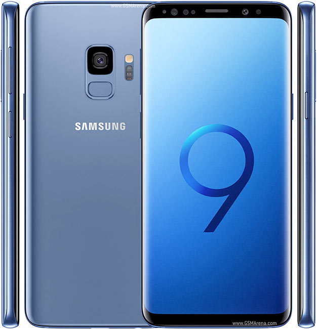
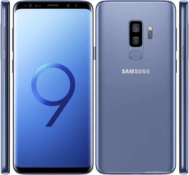
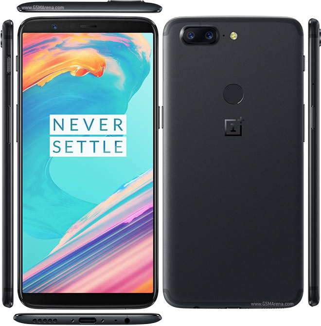
And this is what I really don’t understand: why go to all this trouble with the hardware and software and then package it inside this awful-looking chassis? It makes no sense. There is no way of getting around how bad those top and bottom bezels look, especially when you compare the handset to the LG V30, Pixel 2 XL, and Galaxy S8.
It looks like a phone from 2009.
Why didn't Google just shrink down the Pixel 2 XL? Why not just do that? That’d make sense and it’d make the handset infinitely more attractive. And given all the issues Google’s having with the Pixel 2 XL, the Pixel 2 has never been more important.
I am probably one of the biggest Pixel advocates on the planet. When friends ask me what Android phone to get, I always suggest Google’s Pixel phones. Why? Simple: they’re great, the software is brilliant, and the camera rocks. This year, though, I’m kind of in a pinch because I HATE the way the Pixel 2 looks. Like, HATE-hate it.
Which leaves only one option: the Pixel 2 XL – and that handset, while very impressive in my experience, isn’t exactly faring too well out in the wild, following a myriad of reports about hardware issues.


